
We don’t even look at TestFlight feedback. We want it here.
Understood. I’ll send everything I sent last night, here.
-
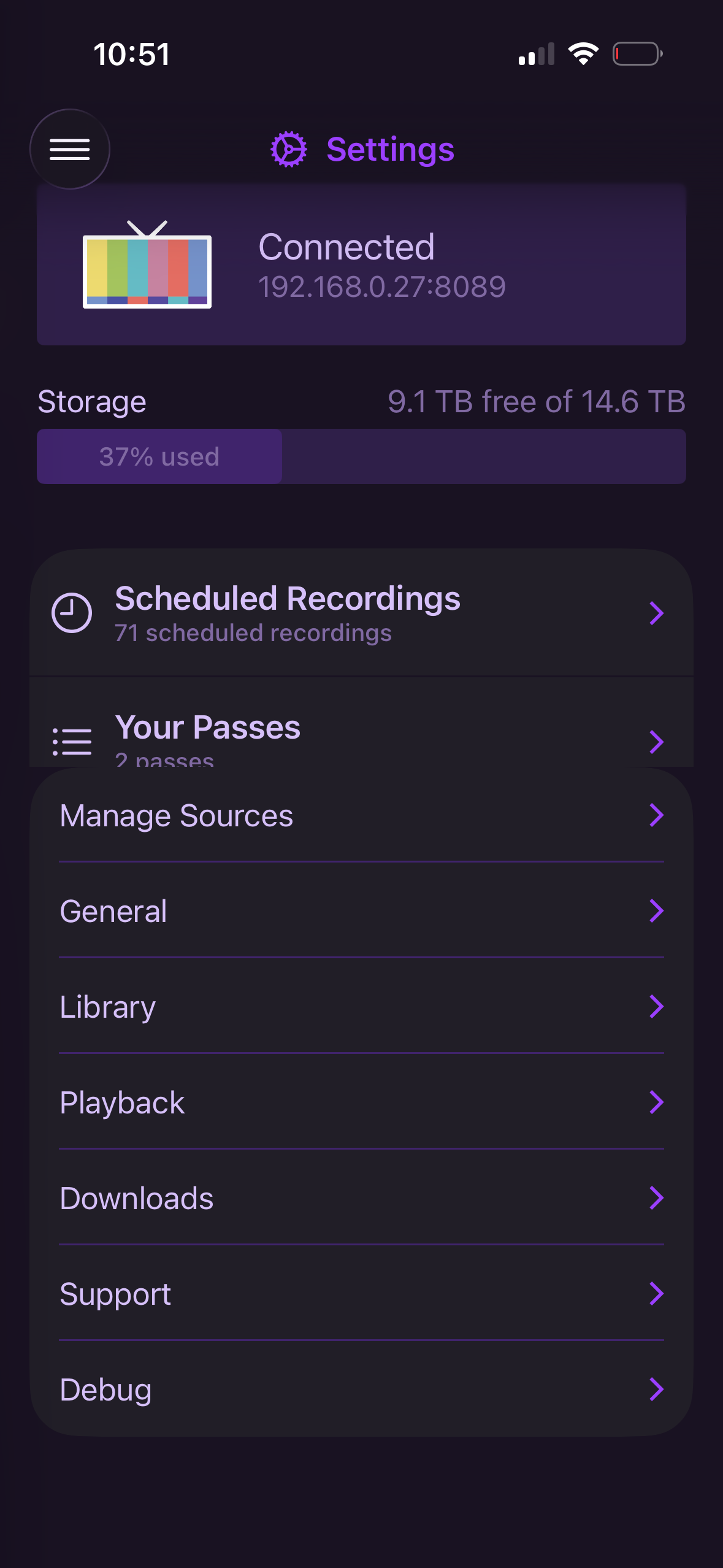
Go to Settings>scroll all the way down to the bottom>enter Playback settings>go back to main Settings window. The passes section will be cut off.
-
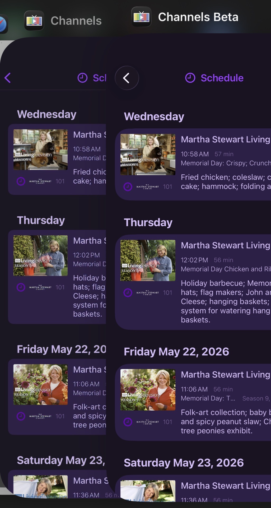
The new UI has much larger radii. The sharp corners of the thumbnails make this a little unsightly. I think the small radius on the current thumbnail implementation is also on the small side and usually looks “too square”. If you could find a happy medium on the thumbnail radius and the new light purple “card background, it would feel more premium. This screenshot compares the existing Channels vs Beta.
-
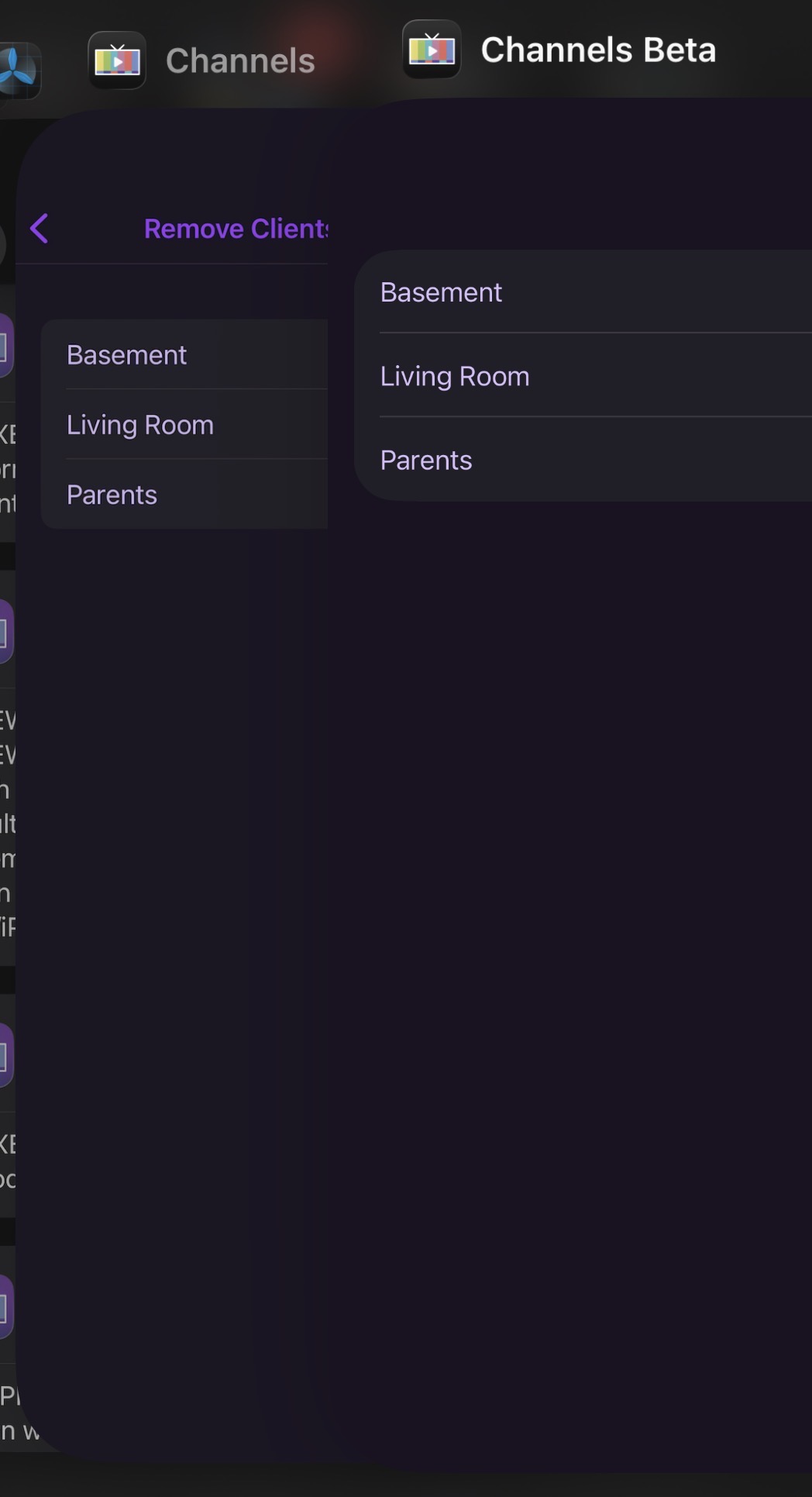
“Remove Clients for Shortcuts” is missing the back button and does not respond to swipe navigation. To exit this submenu, you must close the app.
-
The new UI has a faint line/drop shadow present on the nav bar on tvOS. It’s either too close/interfering with the icons or just overall looks “off”.
Boom. Thanks. A lot of those are already on the list. But glad to hear someone else is open to rounder corners, as that was coming for the exact reasons you mentioned.
It’s funny how rounded evening looked a year ago and mow doesn’t.
1 Like
-
as mentioned above already, when using the Grid keyboard layout, the new search “filter bar” interferes
-
it also causes squishing on the results
-
when scrolling the results, some times they go up too high and sometimes go behind the filter bar
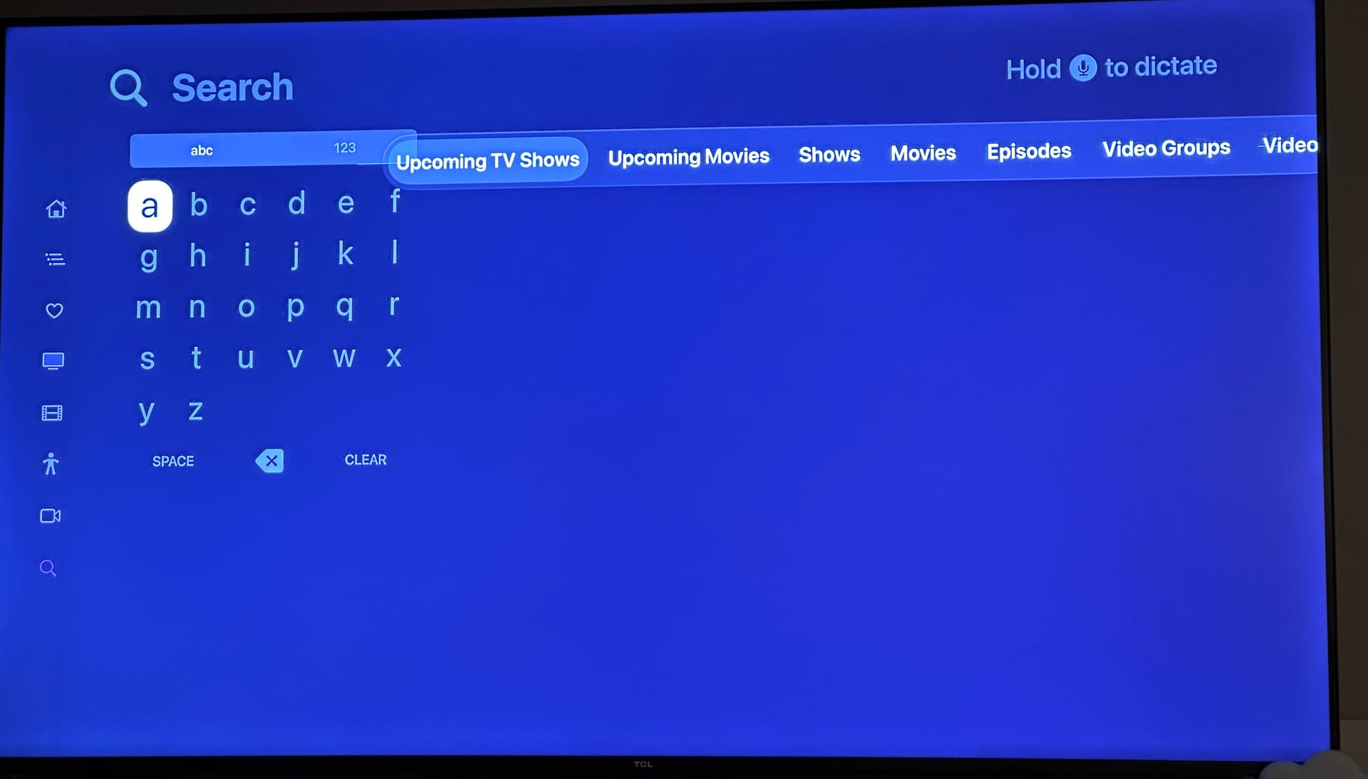
Ugh honestly at this point I’m ready to just remove search. A decade of tvOS not improving what was a terrible UI pattern to begin with. 
Welcome to Liquid Glass
I had my keyboard layout set to linear (as opposed to grid) and didnt notice the overlapping graphic elements, and the results are tamer as well.
 I jest. But looking forward to some updates on the corner radii and what you guys cook up. Thanks.
Just on rounded corners, I think one of the only square ui elements left would be the EPG. Would love even a slight rounding of the boxes if you’re considering it!
These are resolved in the latest TestFlight beta:
2 Likes
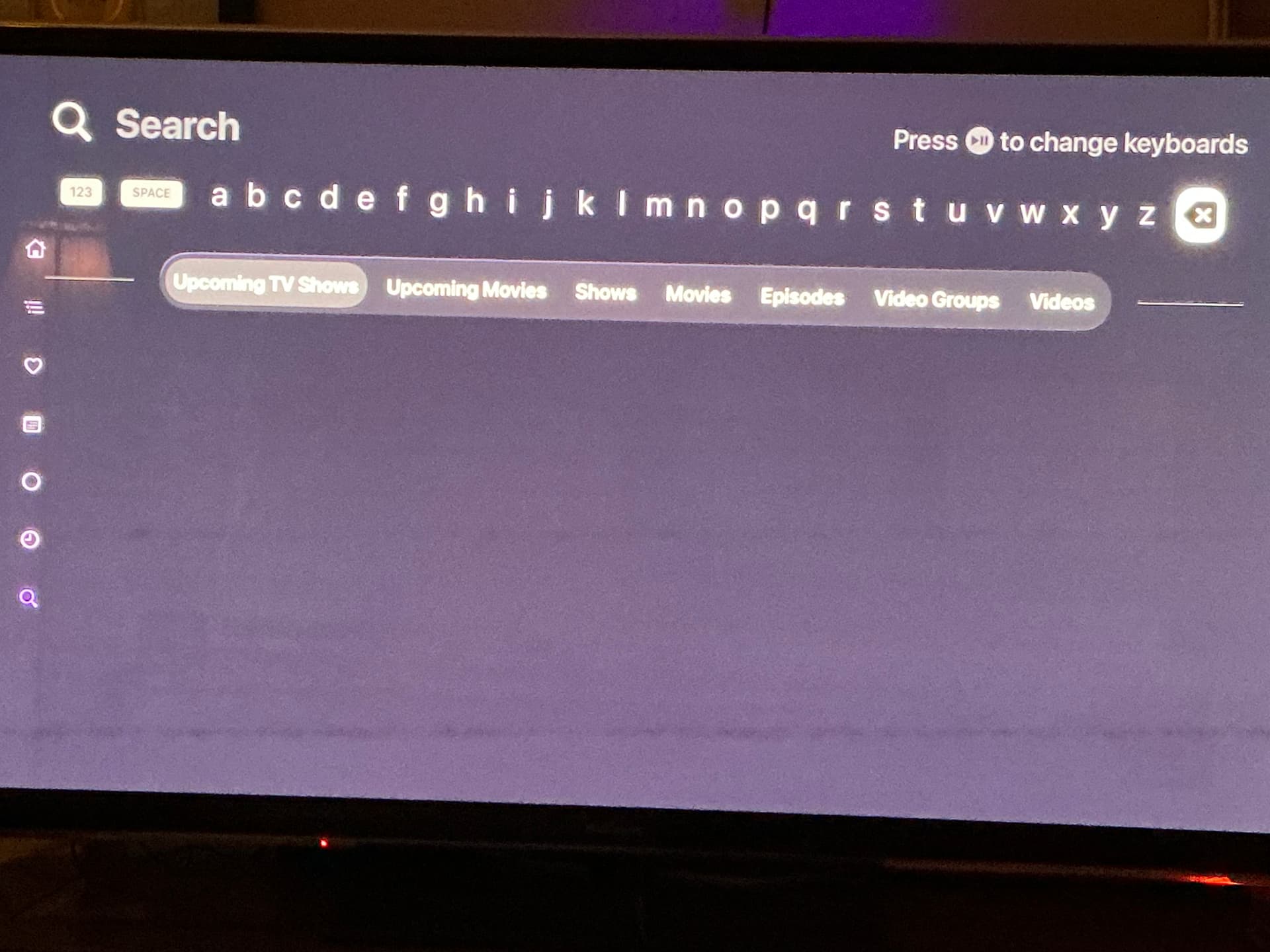
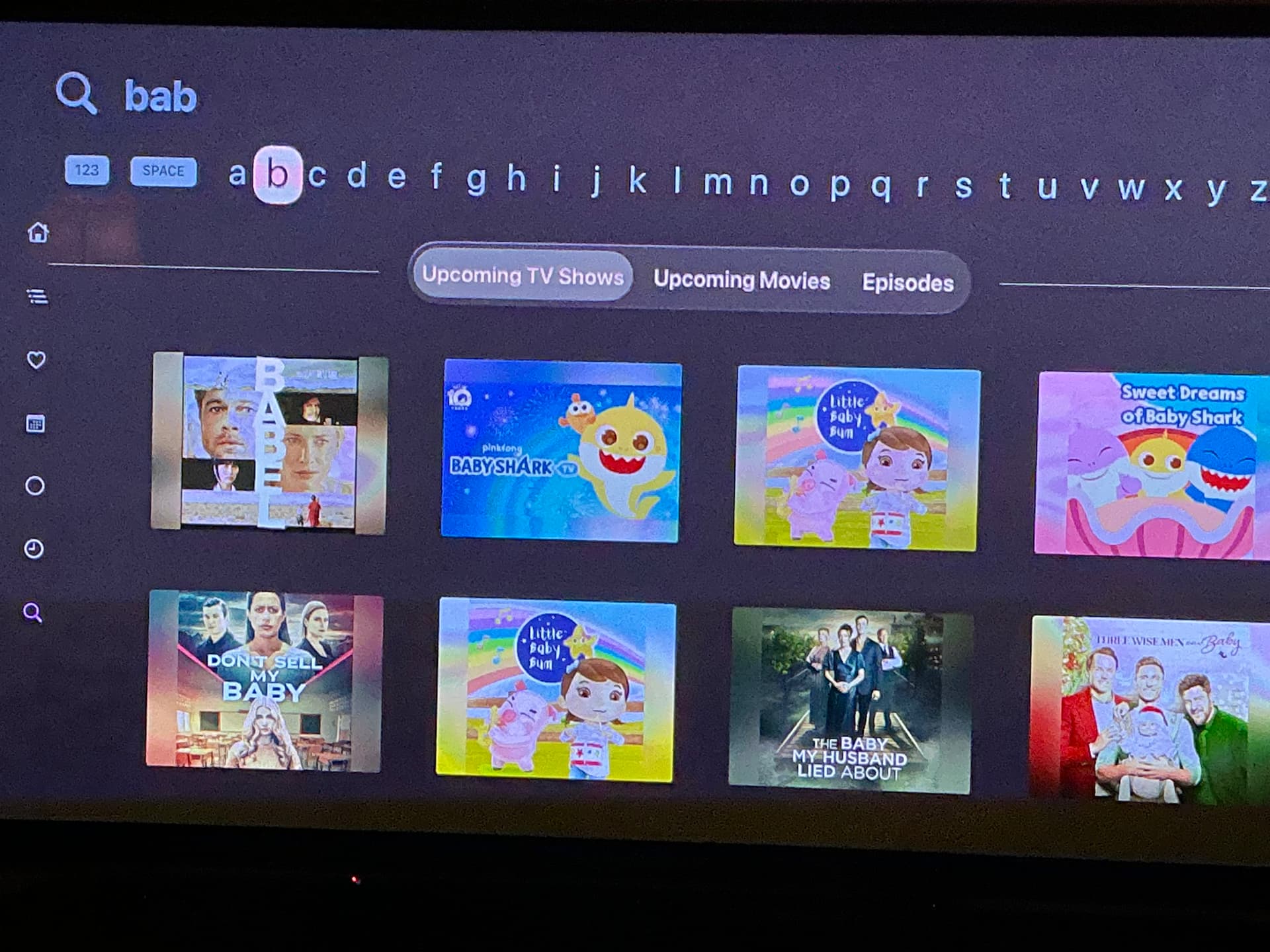
Nice! Looking good and performing well so far. I noticed that the “Upcoming” filters were renamed to simply “TV Shows” and “TV Movies” which show right next to “Shows” and “Movies”. I probably need more content from “Upcoming” to make more sense of it but I wonder if a different word would work that indicates better what it is, while still being short enough.  It is obviously sufficient…just offering my input if desired.
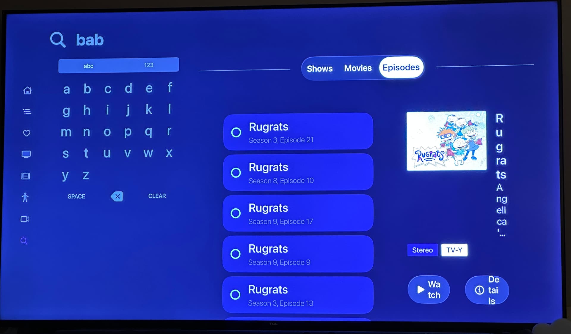
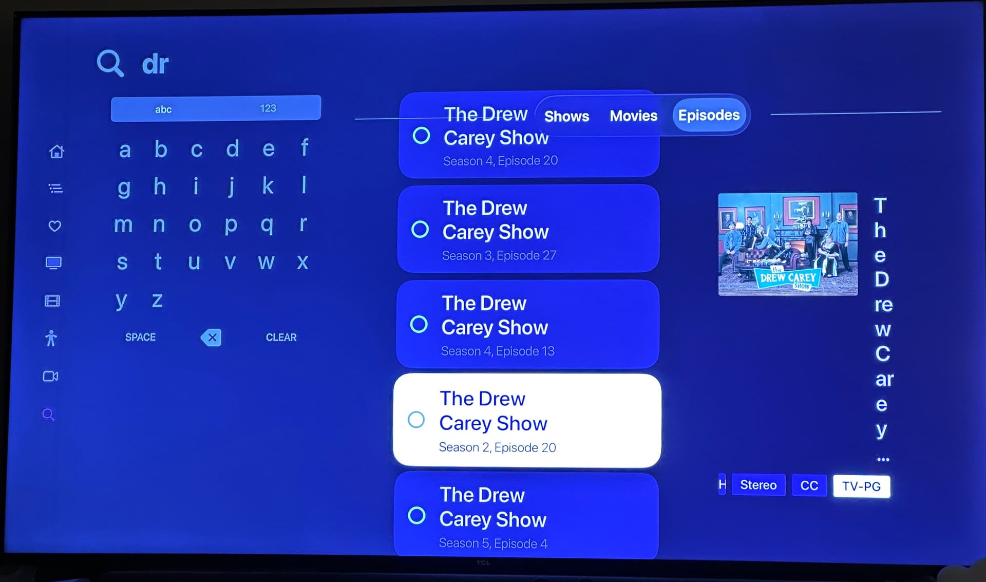
Oh, here’s something. When in the “list” view on search results like Episodes or Videos, pressing back doesn’t take you to the top. I verified it does on the non-beta app, and the other views like Movies.
This was improved in the latest TestFlight beta:
2 Likes
These are the original titles that have been used for years. We went back to them due to size constraints when the grid keyboard is enabled.
The more rounded corners is looking great. 
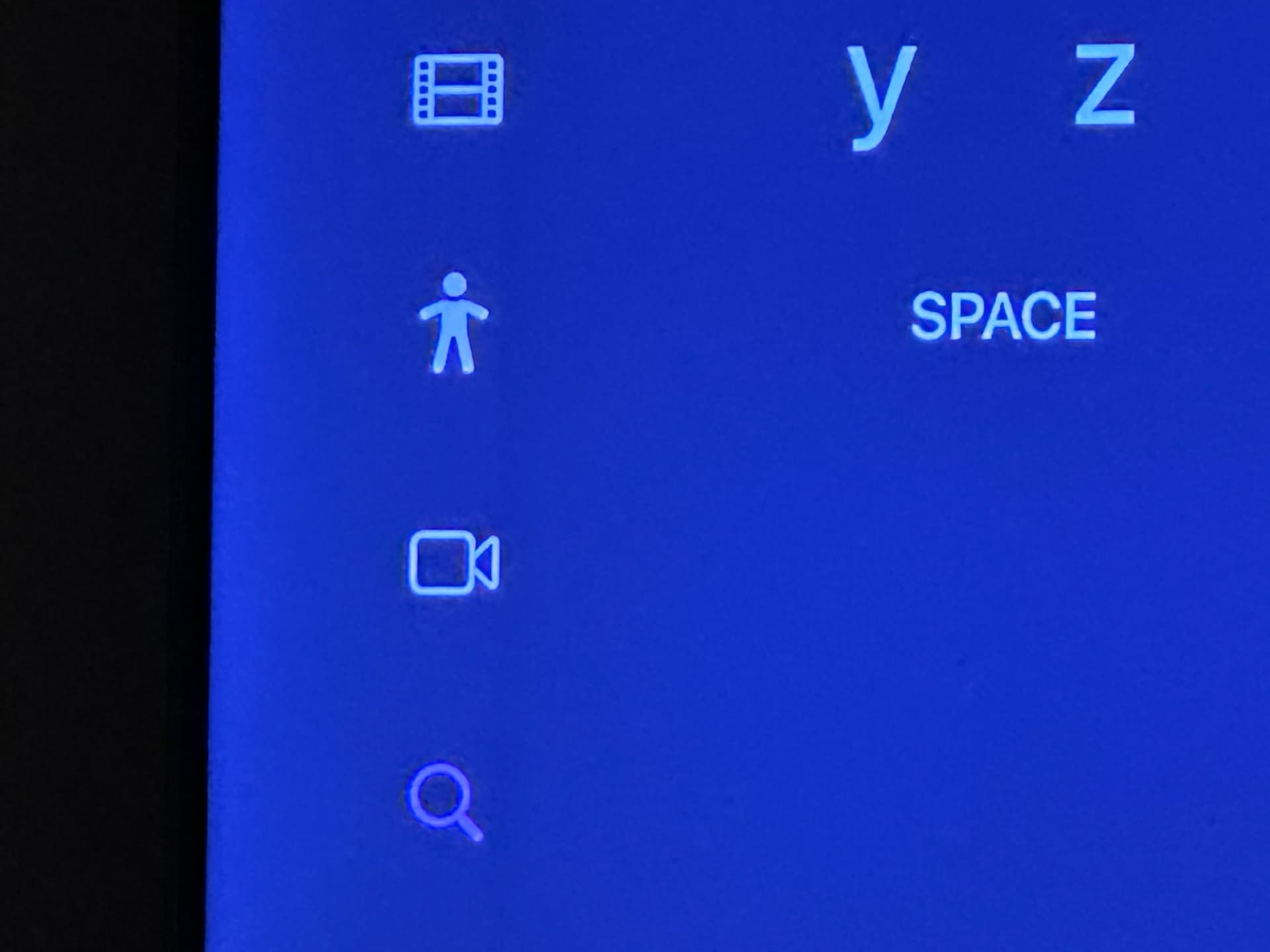
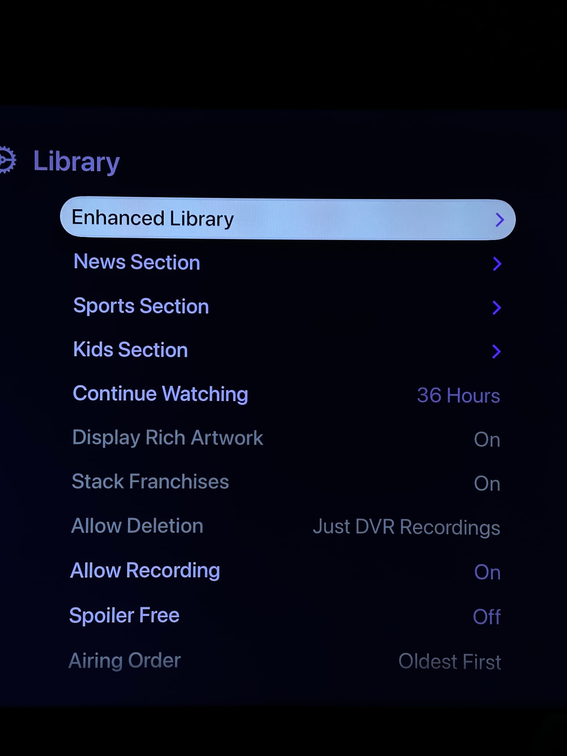
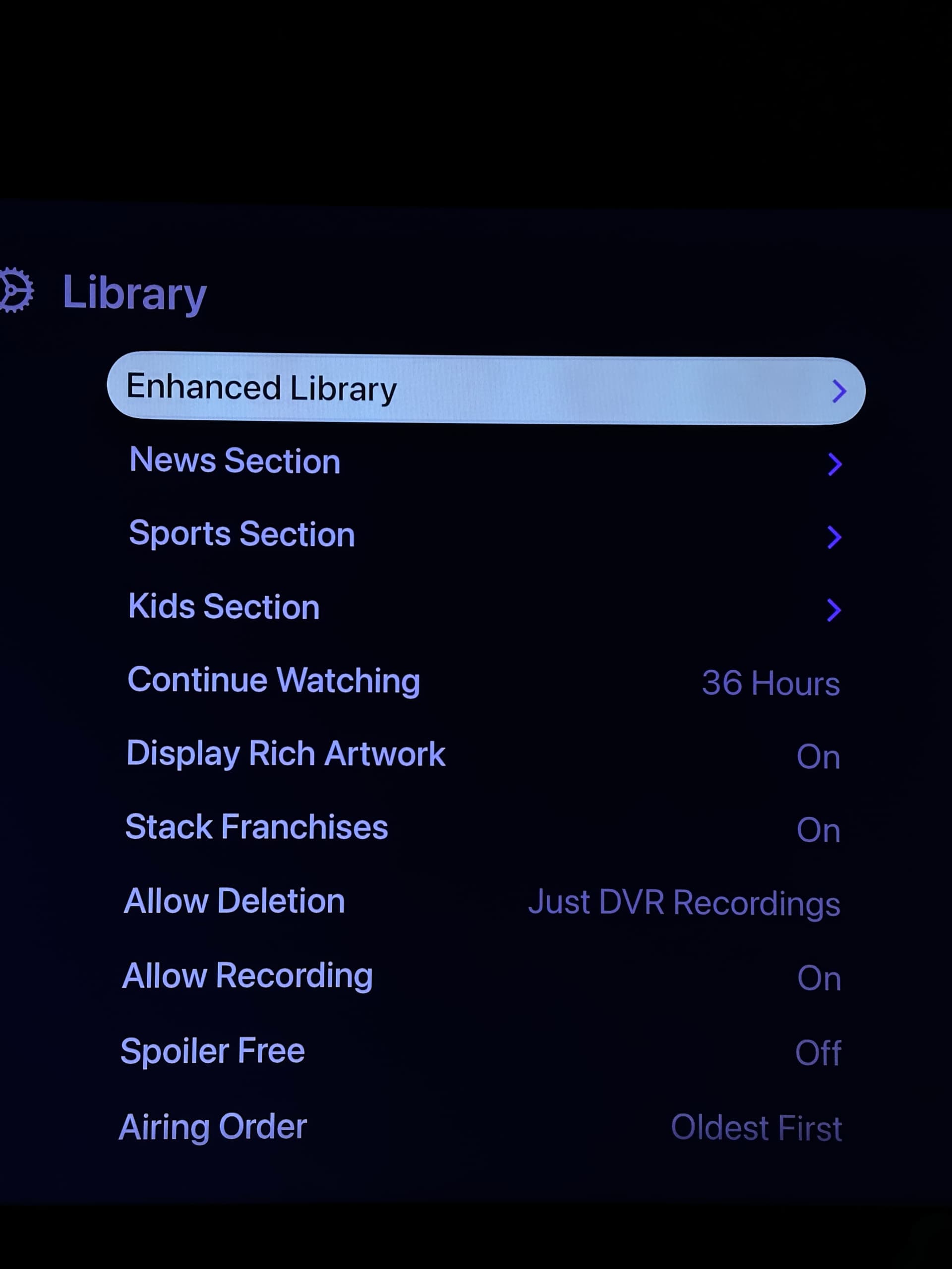
Small thing I just noticed. When scrolling down the list of settings on tvOS, the text for settings that are controlled server side go from gray (unavailable) to normal text color once it’s been highlighted, implicating it’s a setting that can be changed. Had to reduce the exposure on my camera for the difference to show up on my camera - that’s why the colors look off.
This was resolved in the latest TestFlight beta:
1 Like
These have been resolved in the latest TestFlight beta:
1 Like
This is going out as stable as version 7.1.0. Thanks for all the feedback everyone.
1 Like