UI Color Choices

Spoken like a developer... NOT! :laughing:

As others have mentioned, what may seem easy to you, the end user, is not as easy as you think in software. Especially when you have to support different platforms and make sure that everything works the same way everywhere.
I know this first hand because I am a professional developer with focus on testing. Sometimes, even what appears to be a very small change in software ends up breaking something else.

Also keep in mind that this is a 3-person team. You must have seen around the forums issues being reported on a daily basis.
I'm sure the team would rather focus on fixing core features first. That already takes a lot of their time.

As far as I'm concerned, I'm very grateful that these developers have allowed me to use the product that they created in exchange for a tiny amount of my money.
I'm paying for a product that enables me to "Watch and record your favorite programs from every TV and device" (quoted from their home page) and it does it pretty well. They deliver what I pay for and that's why I'm very happy paying for it.
All additional features that they add are nice bonuses.

When I signed up with Channels DVR, nowhere did it say that it would be customizable at will in order to please every single one of its customers.

Would it be nice if the UI was customizable? For sure.
Do the developers have an obligation to do it? Not at all.

Now, if they ever mention in their product description that you can customize it in any way you want, then you have a legitimate right to bitch about it.

Just saying. :grin:

3 Likes

Yea. I too am not a fan of their choice in color theme.
And really miss the transparent seek bar thing from the Carbon theme.
A nice dark theme Ui is my taste.
But, not possible to side load apps onto an Apple TV, even if there was a way to "mod" Apple TV apps.
I can't go back to Google TV based devices...I can not stand their OS since it is a spamm fest of ads and aggregate content.
Though, Apple is not without its sins. And the latest TVos 16 has some annoying bugs....

This may be of some interest to you then. It's relatively easy to get Lineage going on the cheap Onn streaming box from Walmart, among other cheap boxes with the same chipset.

Thread '[OFFICIAL/UNOFFICIAL] LineageOS 19.1 for Amlogic G12*/SM1 Family Devices' [OFFICIAL/UNOFFICIAL] LineageOS 19.1 for Amlogic G12*/SM1 Family Devices | XDA Forums

2 Likes

Many of us are not developers but even we were able to recomplie the apk and modify the color settings. Myself and @AtoZ0to9 posted them for the community to use.

I have even personally provided the necessary config files to the developers for the color changes where all they would need to do is merge in the code.

There is of course more to it but the fact that us non-developers were able to accomplish it easly, I think channels could as well... they just don't want to.

3 Likes

Indeed. They stated clearly to me, that that is their brand look and have no intention of changing it, ever.

1 Like
2 Likes

Yep, think that's a fair and likely accurate answer, and majority rules anyway on endless choice option debates, otherwise all the devs would get done is moderate popularity contests. Honestly I've felt they have nailed it more than about any other app in terms of colors that work for readability and being easy on the eye -- purple is dark enough to be dark theme-ish to not blind you either. I've never seen a screen that makes it harsh, tho I'm sure some do that aren't set correctly or perhaps something wrong with them. Paid apps mean support expected - and folks who want to go off script and use hacks often still come back wanting help when said hack is making their system flaky. Slippery slope. If I was them I'd build a big red button you have to click on every time you fire up a modded or hacked installation that says "you're on your own" and then perhaps let people mod away...

1 Like

1 Like

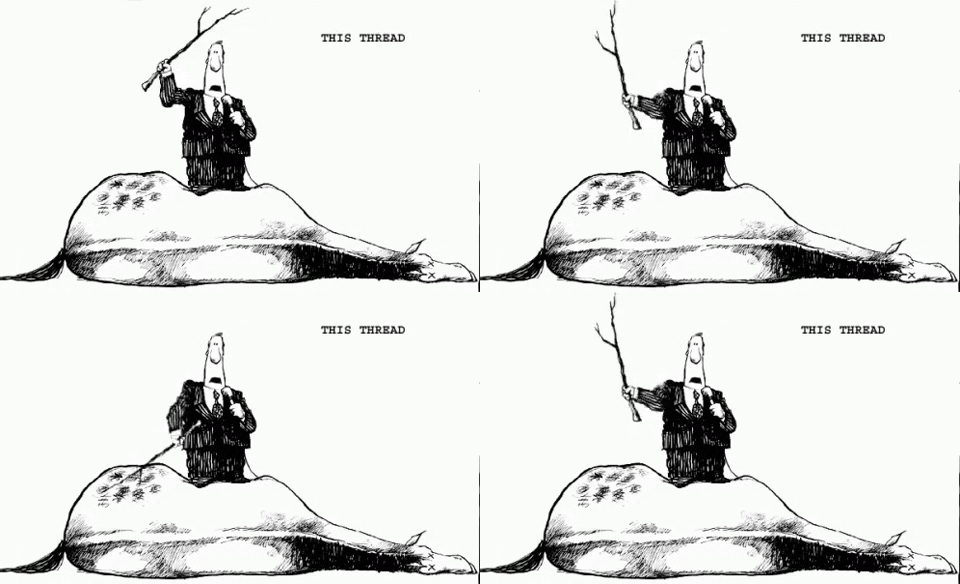
Wait. But we still need to best the dead horse.

How dare the Devs NOT implement UI customization. I pay $8 a month. I am ENTITLED to having my demands meet. This is outrageous. LOL.

This thread reminds me of the clock feature request. The topic keeps coming back in new post. Over and over.

I do agree that purple isnt ideal. Blue would be better. That being said I would rather they focus their energy on useful features.

Feature request: Stop being Nazi's and give me UI customization. NOW!

Godwin's law, also known as Godwin's rule of Hitler analogies, is ** statement maintaining that if any online discussion continues long enough, someone will almost certainly compare someone else to Hitler** .

Soneone should lock this thread. Fear not, someone will bring this issue up in a month on another thread

2 Likes

Cool. The audacity of hope certainly paid off, at least in that case.

5 Likes

Isn't Channels used for a few seconds to find something to watch and then we click and go?
So many people feel entitled these days, QUIT focusing on the color of this app and use what has been developed into a great system for watching and recording TV.

Not really just Click and watch ... but the way your libraries are presented to you is important. Channels developers have spent an enormous time so you can enjoy the presentation of collections and videos.

1 Like

"A few seconds?" I wish! My friends, family and I sometimes spend more time in the interface, searching, browsing, talking and trying to decide what to watch than we do actually consuming content. Lol!

2 Likes

So True a lot of times all I do is Browse and see what catches my eye when I have nothing in mind to watch.

Been there, done that. :laughing:

Now we need to ask the devs to implement this:

:rofl:

1 Like

Please understand that some of us that have asked, have done so because we really do have trouble reading text on the interface. The purple with lighter purple text is difficult for some. I have no issue with the choice of purple for branding. All I really wish for is that the episode numbers in the list of TV shows was white and not light purple. Then I'd be able to read it from the couch.

So if it doesn't happen, I'll keep using Channels but I'll do as I do now. If I can't read what it says, I get up off of the couch step closer and read. Kind of like the olden days before remotes...

3 Likes

Personally I think if they want their product to be purple that’s their choice and don’t have any issues with it. However there has been several people with this complaint

And I don’t think this is the user experience the channels team would like to provide. Perhaps a tweak is necessary.

3 Likes

Like the topic title
Capture

I find white contrasts well with the purple and is readable.

You know, that's not a bad idea. I don't really have trouble reading the text, but I could see that for some. In the app, I notice that the icons for "All Movies" and such, the text is white. At the top of each page the text is light purple on darker purple. That would be a solution for those with the reading issue at least.

I otherwise like the purple personally.

1 Like

YATA...