Thanks, I noticed that too. It was the addition of glass as the halo highlighting the Director and writers. I haven’t been able to look at that yet.
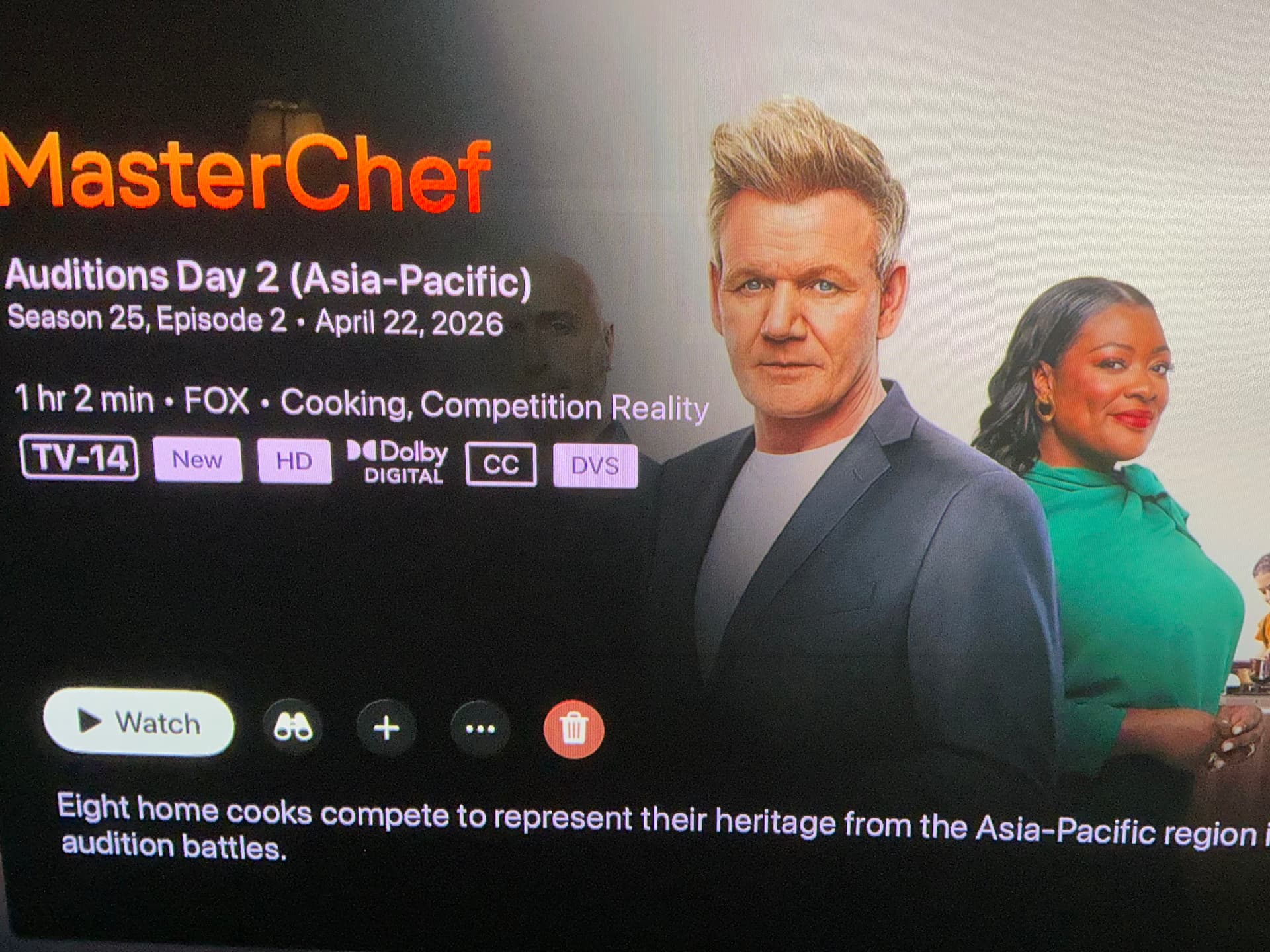
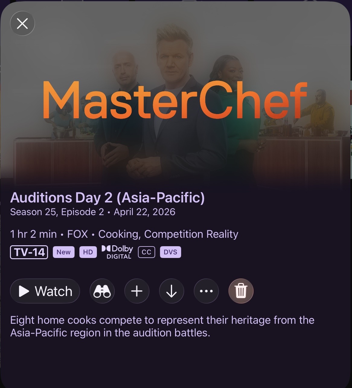
Here are a few screenshots from the beta on an m4 iPad Pro and a few from the Vision Pro for kicks.
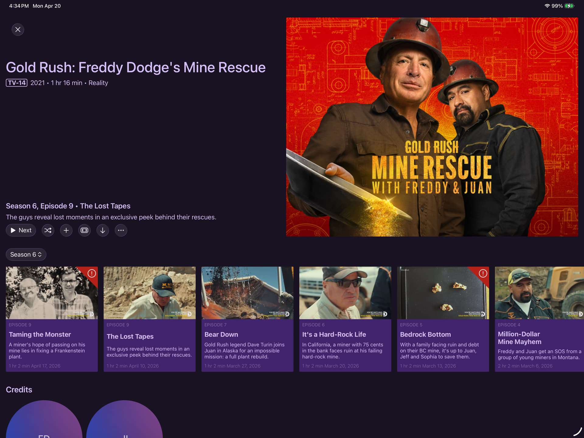
Not sure what text issue that is in the screen with text on mine rescue. First saw in AVP then checked on my iPad Pro and it appeared the same.
Left nav bar, I realize you do not support the Vision Pro. It would be helpful to add mouseover states to the buttons since AVP uses eye tracking and you can't tell what you're trying to open. You may say well, it's an iPad app. I at times you an Apple Smart Keyboard with mine - I actually had it attached while testing and I'm using a trackpad and a keyboard so you may be able to justify this base on the iPad and it will improve the AVP experience.
Loving the Liquid Glass!
1 Like
This is resolved in the latest TestFlight beta:
4 Likes
I know Im being nit picky about this, but I was noticing the red trash button really sticks out on the Apple TV. It really draws your attention too much.
Surprisingly, I noticed that on iPad, the trash button is much more “liquid glassy” and subtle.
Apple tv
iPad
Any way to make the Apple TV trash button more liquid glassy, like on the iPad?
Thanks for all you do!!
1 Like
Yeah, that's just how tvOS renders it. Honestly, so far my experience with liquid glass on tvOS is trash. I was REALLY not well attended to, but we know how much attention tvOS actually gets on these things.
I'm not sure I even really prefer the red, and considering it's buggy (mentioned earlier in the thread), I think I'm going to just remove the color.
Both resolved in the latest TestFlight beta.
1 Like
I preferred the red tint to the delete button. Harder to not accidently select it. lol

Agreed
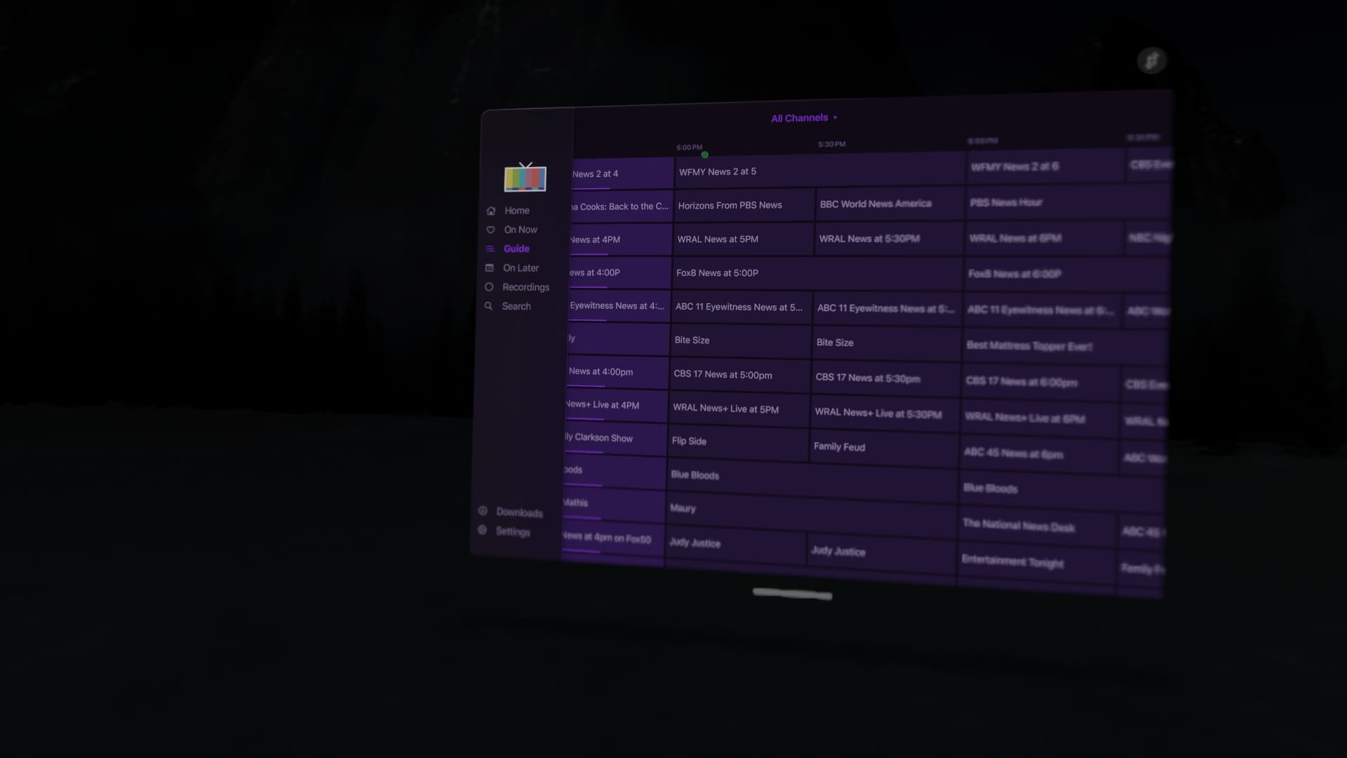
Decent sized update just landed. This one gets the iOS app more in line with Liquid Glass design conventions and adds contextual search throughout the app.
Now, each main section like Home, TV Shows, Movies, Kids, etc have their own search bar allowing you to search that section. This replaces the legacy Search section on iOS 26. This section remains when running on < iOS 26 and tvOS.
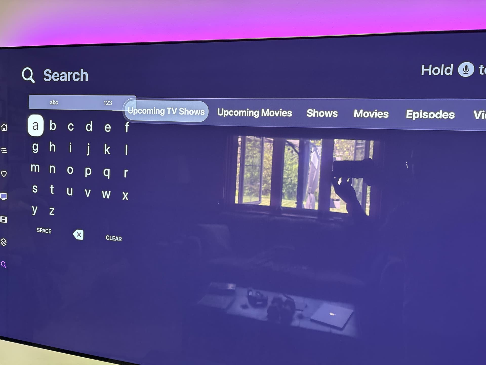
Noticed the new search approach for movies, tv shows, videos, etc. on ipados.
I did observe collections search is missing. Was this intentional?
How many Library Collections do you have? This didn't seem like something that was that necessary.
Not a ton of collections, but I have had up to 6 or 8 in the past. Currently only 2. It shifts from time to time. I do however, use my current collections for “hidden view” shows. A mix of recorded and local content.
My spouse records a ton of material that clutters my normal home recently updated and up next. And i have a ton of shows that she thinks are too violent. So the solution here is she has a collection and i have a collection and these are hidden.
So possibly it be nice to search the collection, although it certainly is not s show stopper.
Thanks!!!
Liking the changes so for with the UI and Liquid Glass...but...
Still hoping for actual transparent panels during playback, like how the native Apple TV menu comes up on the upper right corner.
Do you want feedback here or is send feedback through TestFlight sufficient? I spammed the feedback a bit last night 
In a lot of apps that have this, it’s very laggy for me on the 2nd gen 4k. I would prefer to keep the faster Channels implementation…or perhaps it’s just a matter of optimization not done in the other apps. 
Transparency in the UI in Channels not caused and lag or issues with the Carbon version. On android tv. Don’t think it would cause any here.
Great catch. Thanks!
We don’t even look at TestFlight feedback. We want it here.
Understood. I’ll send everything I sent last night, here.
-
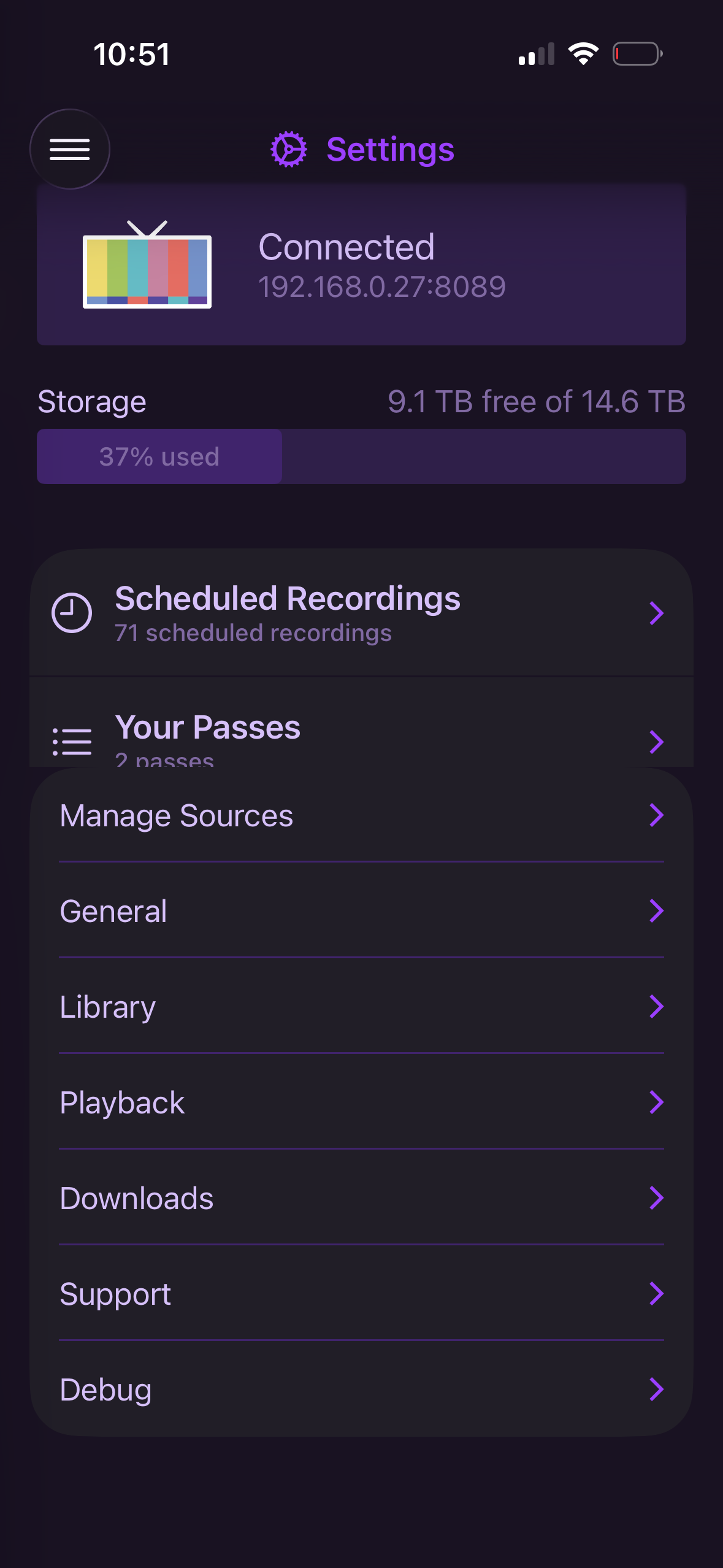
Go to Settings>scroll all the way down to the bottom>enter Playback settings>go back to main Settings window. The passes section will be cut off.
-
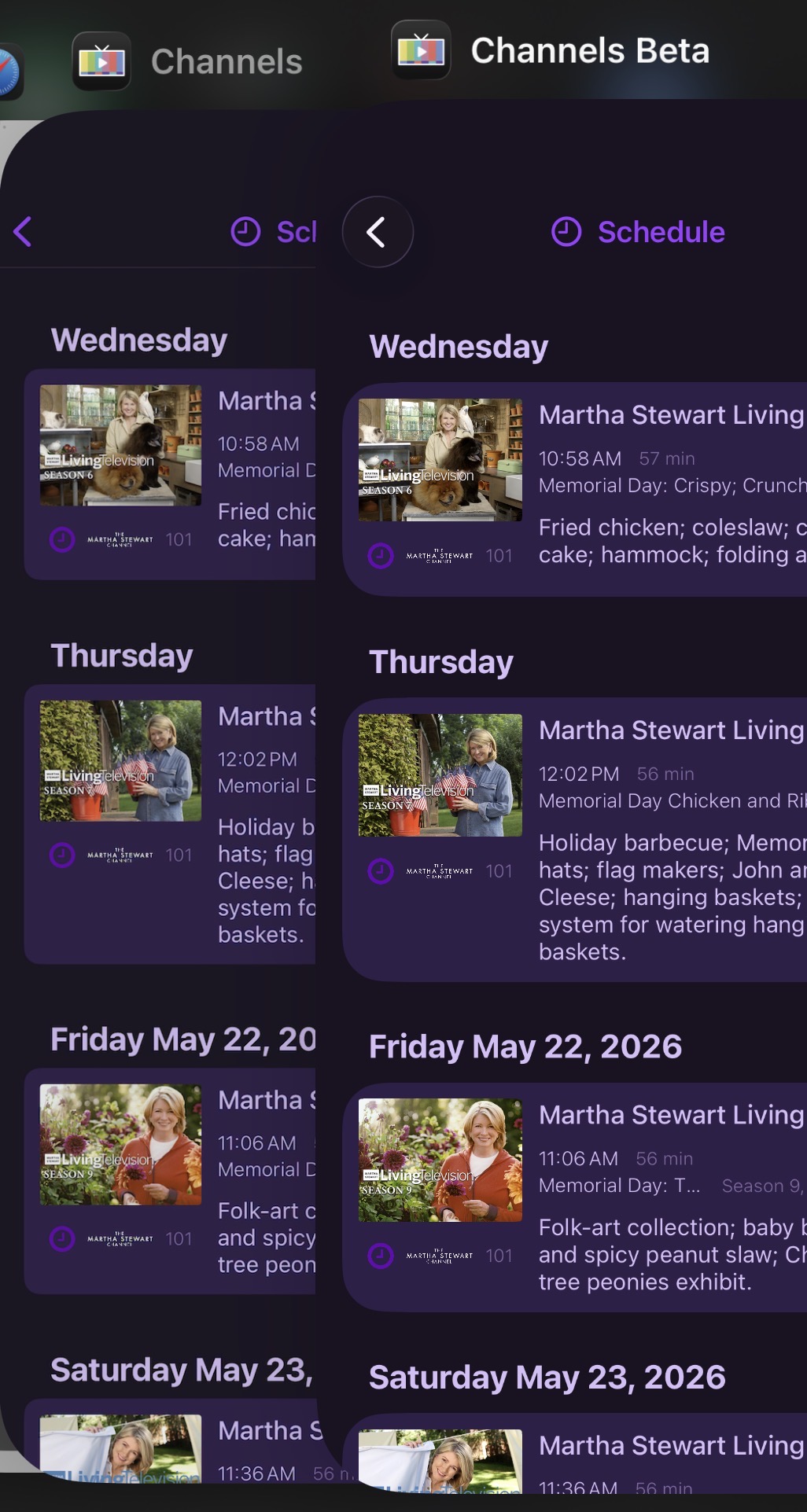
The new UI has much larger radii. The sharp corners of the thumbnails make this a little unsightly. I think the small radius on the current thumbnail implementation is also on the small side and usually looks “too square”. If you could find a happy medium on the thumbnail radius and the new light purple “card background, it would feel more premium. This screenshot compares the existing Channels vs Beta.
-
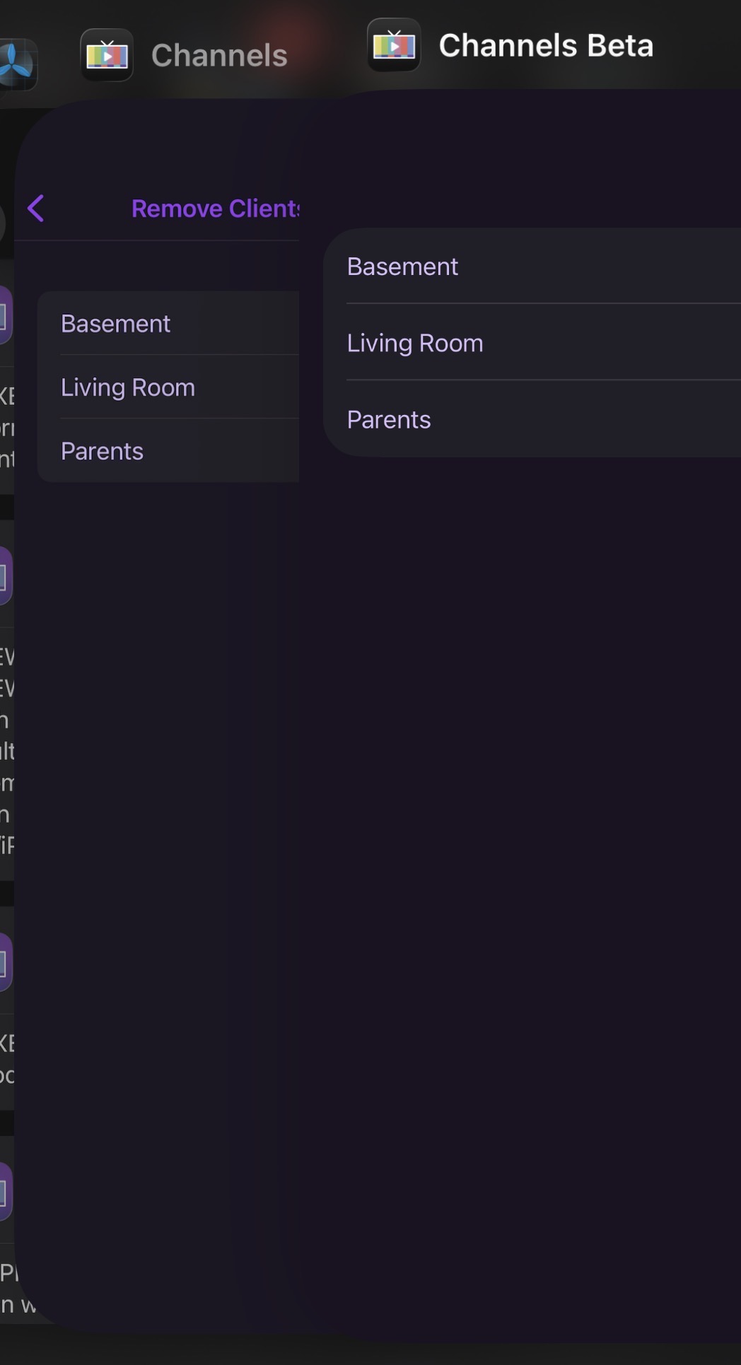
“Remove Clients for Shortcuts” is missing the back button and does not respond to swipe navigation. To exit this submenu, you must close the app.
-
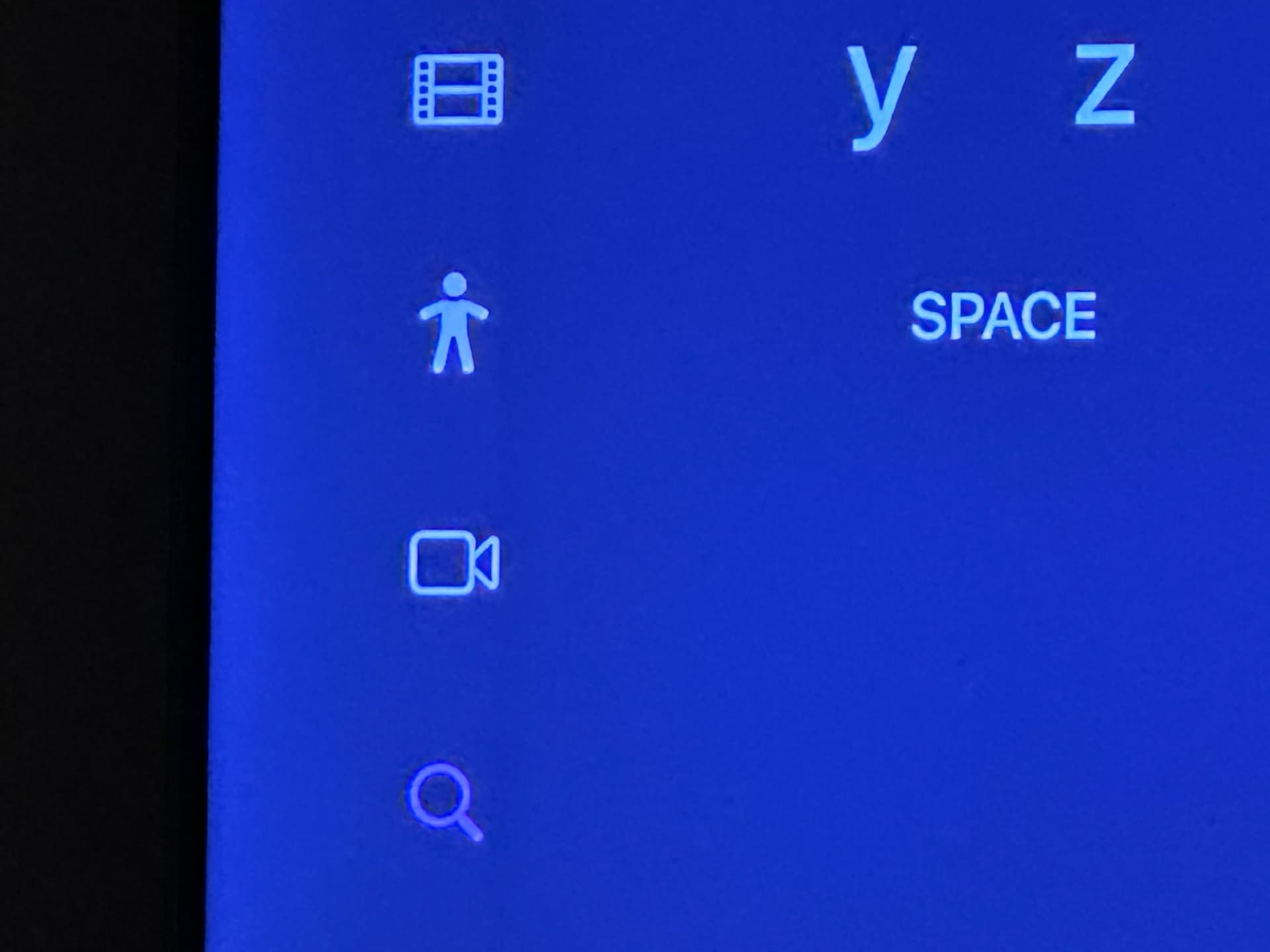
The new UI has a faint line/drop shadow present on the nav bar on tvOS. It’s either too close/interfering with the icons or just overall looks “off”.