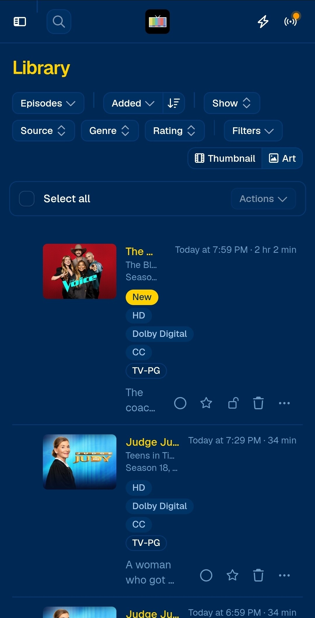
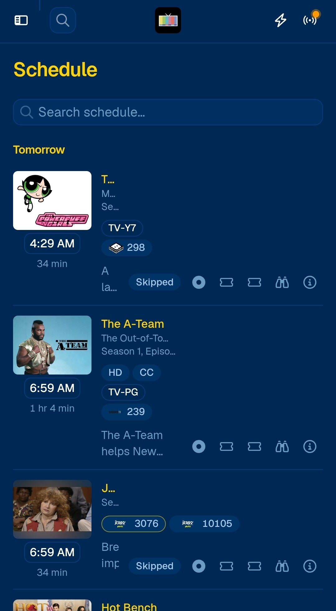
Description of issue: when viewing episode details in the library and also in the schedule, the details of episodes are not displayed properly. The tags are occupying too many rows and the titles are cut off.
I expected: titles, season/episode numbers shown completely, tags side by side in a row.
As a reference in the legacy interface:
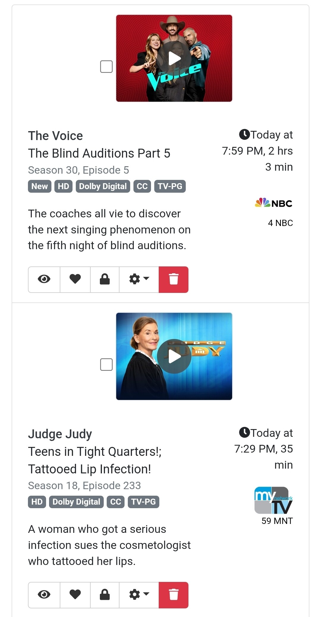
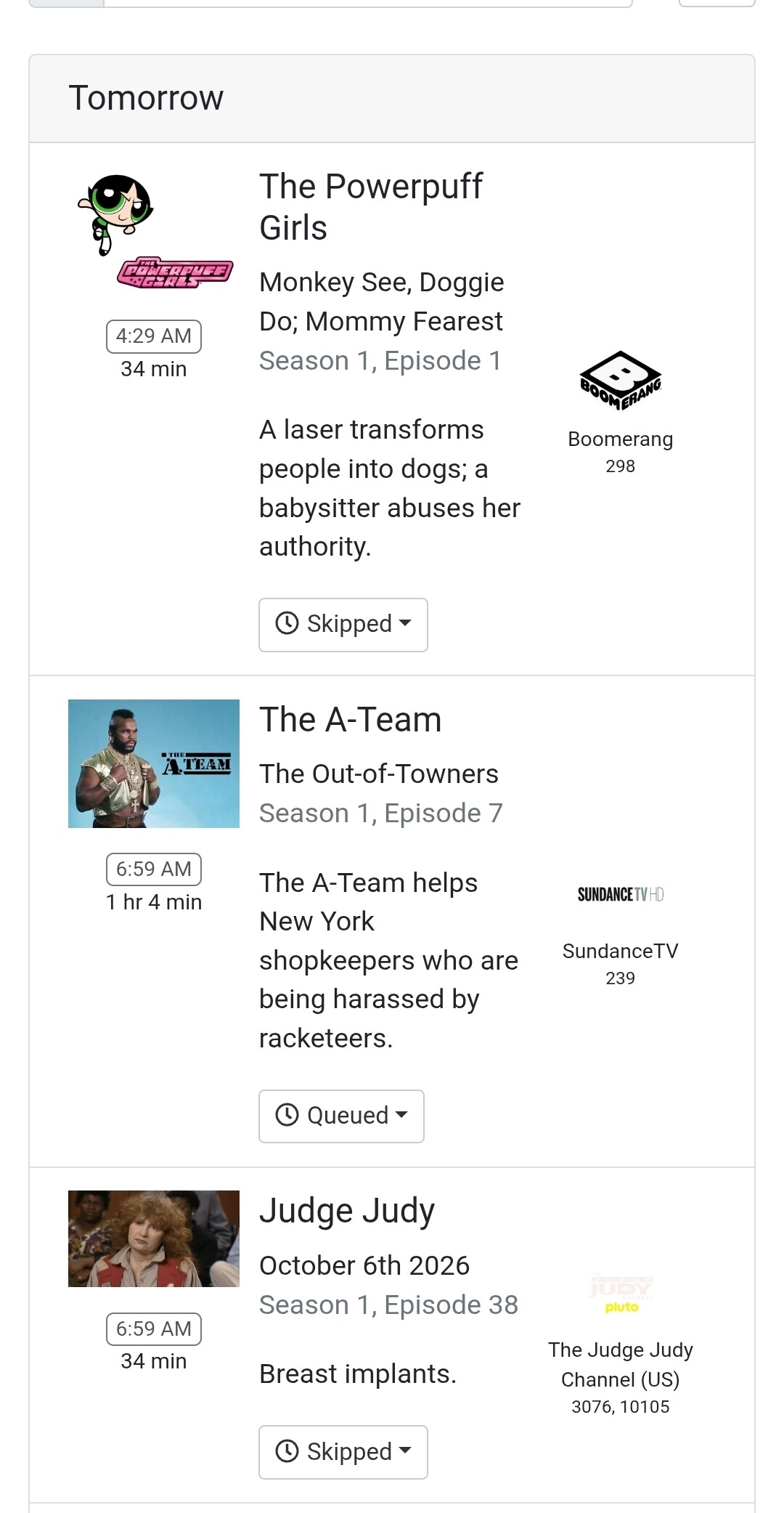
What actually happened: