
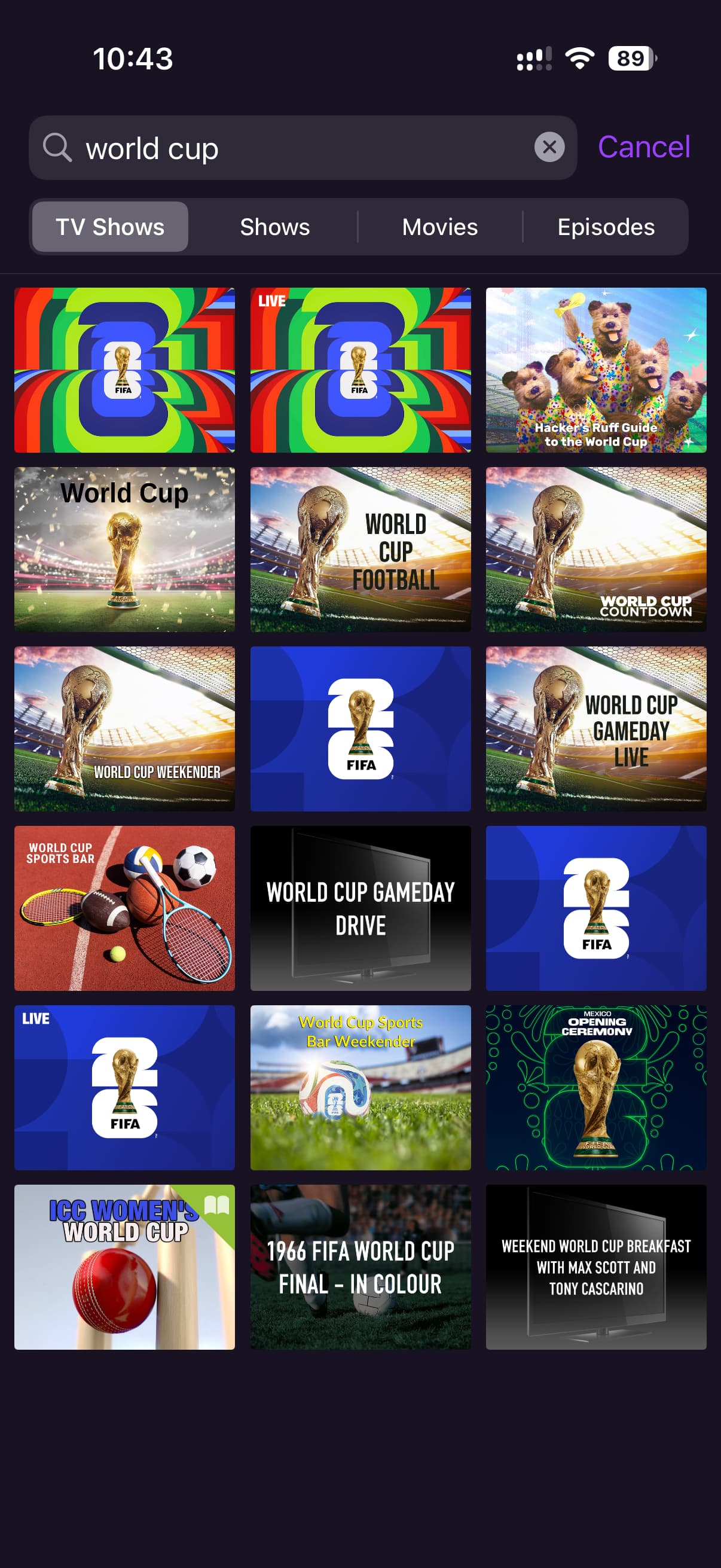
When searching for something like “World Cup” the search results are difficult to navigate.
Some of the problems:
- the thumbnails are not relating to the actual broadcaster’s branding
- there is no detail about the actual show for each returned search result
- when multiple similar or the same results are returned there’s absolutely no way to differentiate between them without tapping into them
Tapping into them is OK if there’s a small number of results, but when there’s so many similar results, this is not practical.
My feature request would be to change the search results UI to display a list which would include thumbnail, title, channel and show description. Ideally it would also indicate when the show is being broadcast but appreciate this would be a more challenging UI.
With a list of shows that include title, description and channel, we would easily be able to scroll through the list and skim read to identify the ones that might actually be the results of interest. This would be a substantial improvement over only having the thumbnails.
Perhaps there’s an argument that both UI presentations should be available and let the user decide. To me this would be marginally worse than only having a list because it would be something I need to choose (maybe each time) rather than just getting the info needed immediately.