
I know we had a long and somewhat frustrating discussion about the show progress bars in the guide and how I think a simple drop line would be a much better solution.
Anyway, I noticed another problem with the progress bars.
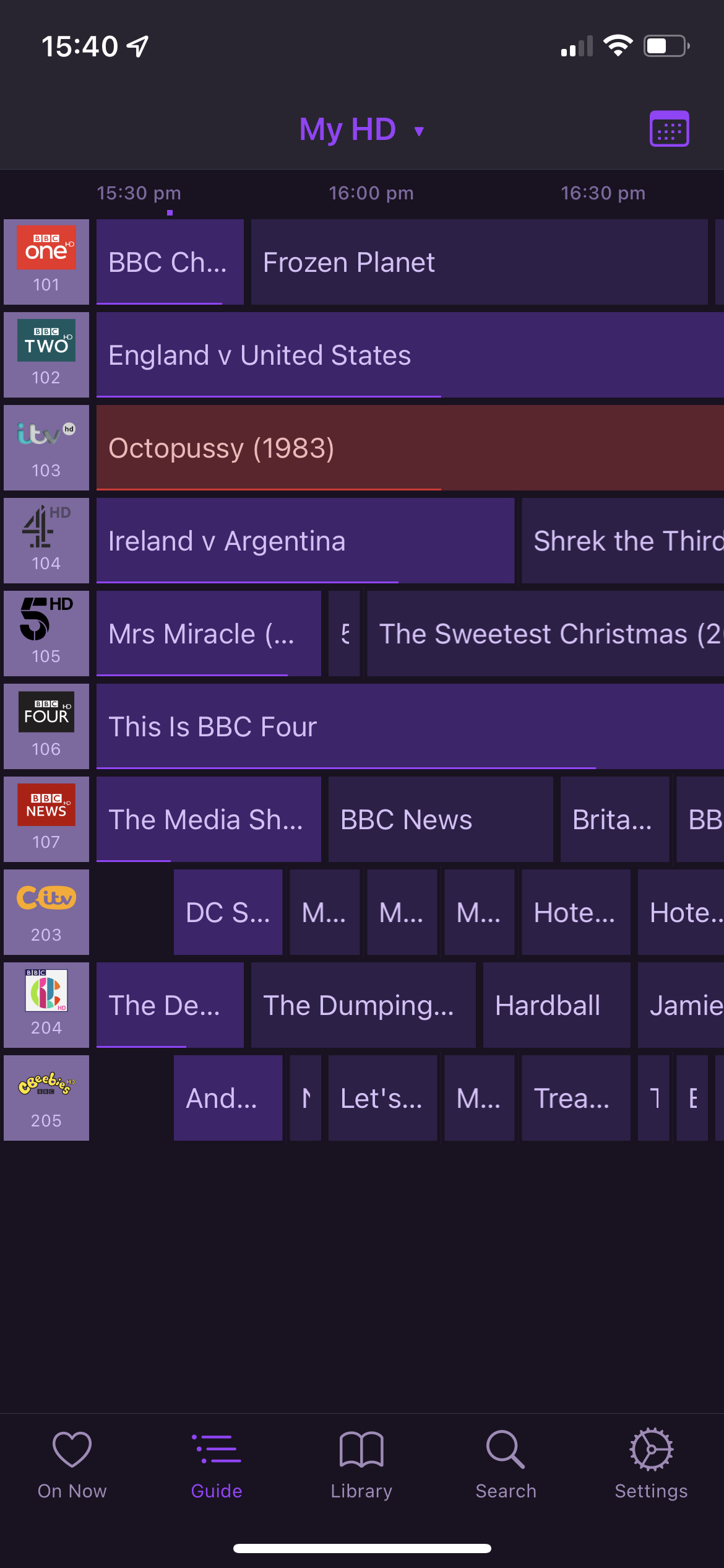
When a show is so long that it doesn’t fit on screen, the progress bar does not provide any useful information.
For example, on this first screenshot, it looks like Octopussy (for example) hasn’t already been on for some time.

Then here it looks like it’s only been on for a bit:

Finally, this is the furthest left I can scroll and you cannot see the right hand end of it, so a % based progress bar is really not much more use than something that tells you it’s already part way through.
I really do wish a more simple and elegant solution had been taken.