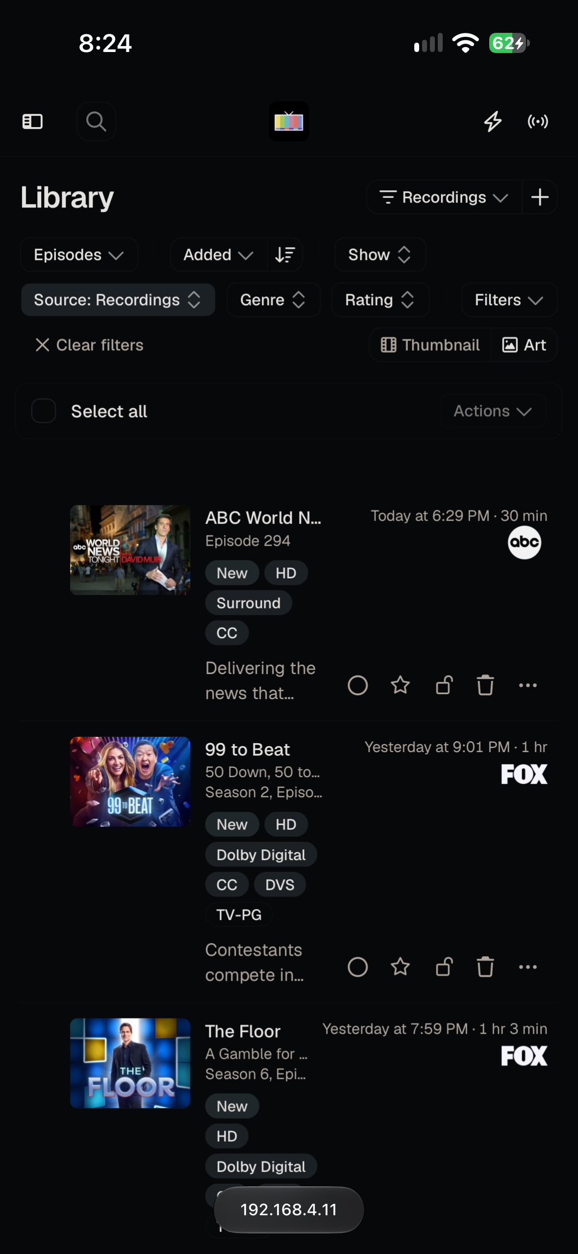
Description of issue: The list of shows/recordings is very cramped when viewed on a mobile device. The titles and description are cut off.
I expected: The titles and description should use up more width of the screen. The tags (New, HD, etc) should be moved under the date and channel logo to free up more space.
What actually happened: