Web Interface -> Advanced -> Padding: No Labels?

A program we record daily had 3-hour negative padding for the start in the Pass. That disappeared this morning.

Now, for the two Padding options there are drop-down lists. Looks a lot handier than what I recall.

Thing is: No labels on the boxes:

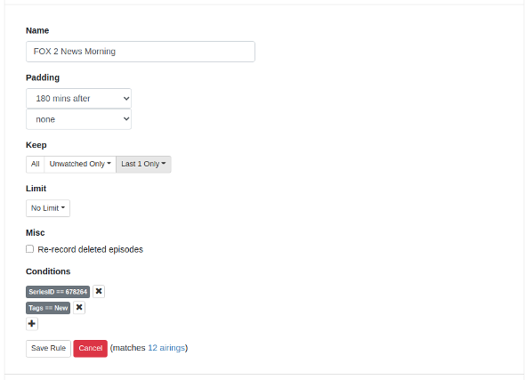
I presume the top box is program start padding and the lower one program end padding, but labels might be handy :slight_smile:

I think it's called the "Minimalistic approach".
Like hiding the Update to prerelease in a dropdown so it doesn't clutter the screen.
I actually liked the older web UI that was much more compact and didn't take half a screen height to show an advanced pass in. I'm constantly having to scroll down when I open an advanced pass to see the bottom of it.

Minimalism is fine, but dialogue boxen should have labels indicating what their values do, no? :wink:

Only if you want to take the joy of discovery out of the equation. :sob:
Think of the users that have no idea there are pre-release versions or even how to get them.
Or questions like "what does this button do" ?
They would stop coming to this Forum to ask those questions.

1 Like

If using the Advanced rule editor makes you question which drop down is before versus after, maybe you shouldn't be using an advanced option in the first place ...

1 Like

Perhaps this would be more intuitive?

And if you really were Advanced you would choose Custom because you read Release Notes...
Capture

OK, had my fun for today :grin: