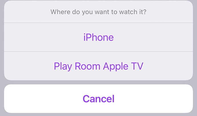
It seems to me that the titles for the where to watch options could be improved. Specifically, the title for the device that you are currently using.
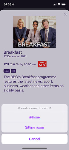
For example, if you're using an iPhone this is what appears:
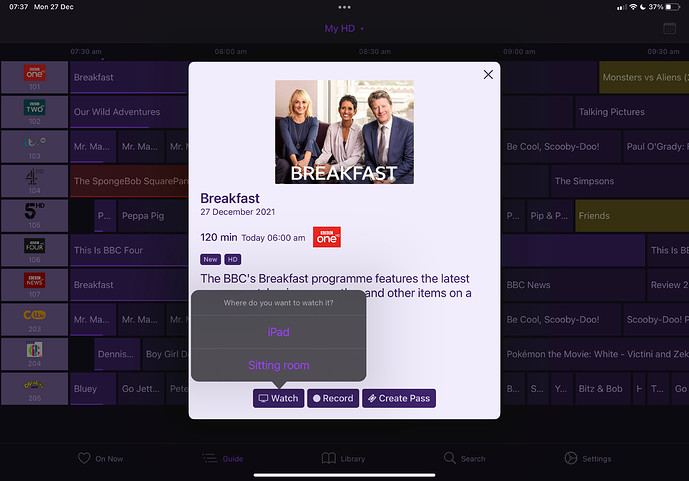
If you're using an iPad:
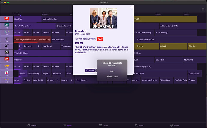
And on Mac (Apple silicon / M1) rather confusingly:
It struck me that even on the iPhone and iPad I always have to make a double take because there's a mental leap needed to work out whether the 'iPhone' or 'iPad' refers to the iPad or iPhone that is currently being used or perhaps another device (we have many in the house).
Wouldn't it be much clearer and more robust if the top item in the menu simply said "This device". That would work regardless as to whether it was an iPhone, iPad or Mac. Personally I would make this top item bolder or more prominent as well.
The huge advantage of that would be that for the Mac, this would then make sense because, whilst I understand it is running an iPad app, it wouldn't say "watch on iPad" despite being on a Mac which is really kind of weird.


