Submit diagnostics from your server.
Just to be clear, the score isn’t new, it’s been there for ages.

Submit diagnostics from your server.
Just to be clear, the score isn’t new, it’s been there for ages.
You have to have the beta Channels app.
Ah OK thanks. I just submitted 67c72f3c-53b4-4b24-835b-3d1054a1aaa6.
Ah yes, I forgot to mention my ATV is running Beta 5.21.146. But I'm sure you'll see that in the diagnostics I sent.
The latest beta build is 7.19.1902
You need to go to TestFlight and update it.
That was it. I'm not an Apple user I'm strictly Android but I bought the ATV just for Channels.  I didn't realize I had to update TestFlight every so often. I think it said 90 days when I just updated it. I'm all set and thanks for the info.
Best update since I’ve been apart of the community. Awesome work and hope you guys keep taking channels in this direction!
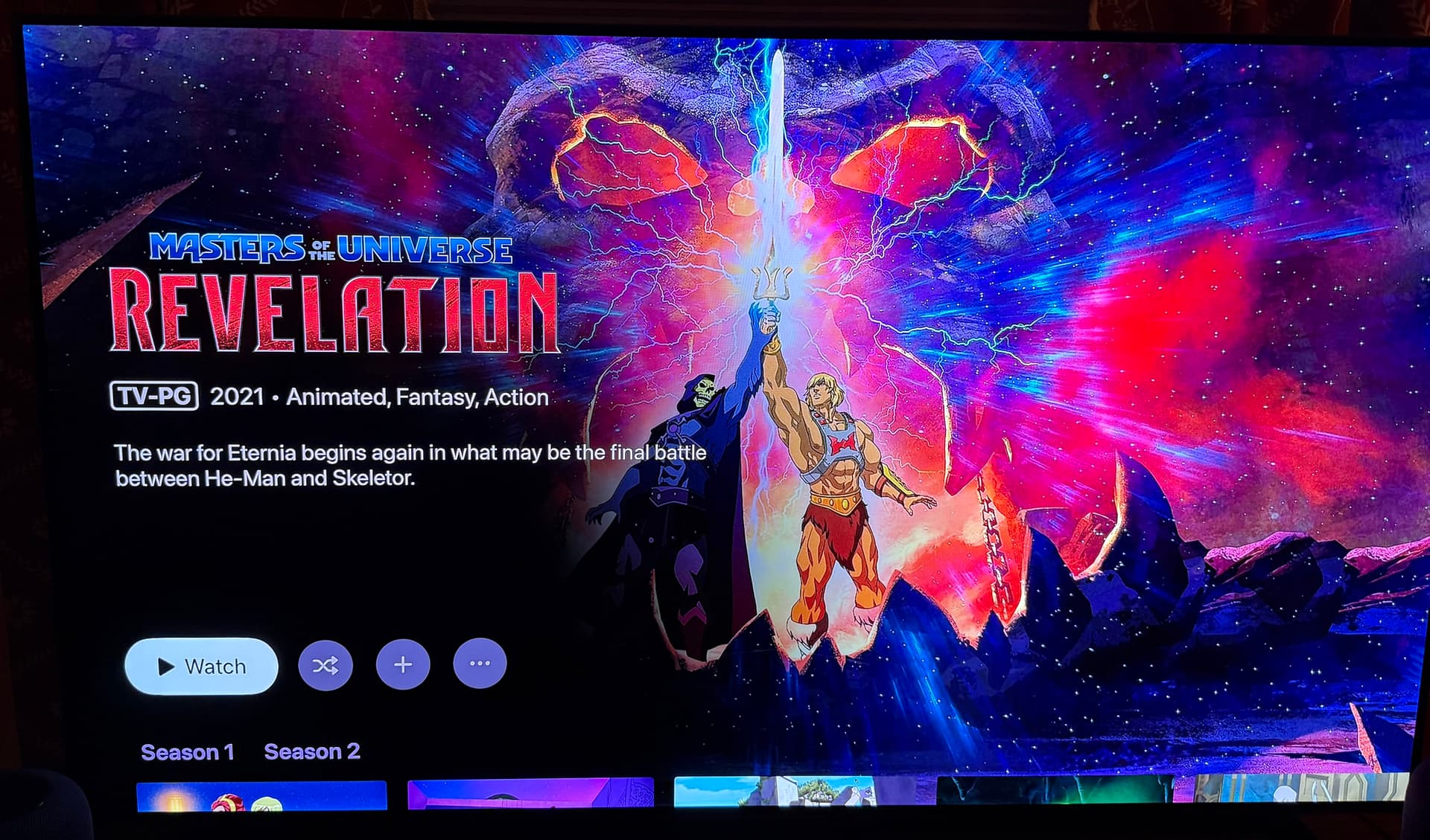
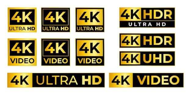
I absolutely love this, but can i beg you for one change that hit me immediately??? Please change the "4K" and "HD" to something better (and any other purple logos like "DTS" and "HDR" from the screenshots)... I beg you! It really detracts from the view and stands out horribly. Something like below (and the "HD" equivalent) would look great and polished.

Also, I have noticed the score color background changes based on the number (percentage). Maybe rather than have a background that surrounds the number, make the actual number bold and colored (no background). I think it would stickout less, but still provide the information you are trying to convey at a glance.
Just a thought with the TVOS version. Could you slide everything up a bit. It seems like there is a lot of space above the logo and if you could move it up a bit you could see the episodes. Just a thought.
Love the update!
One minor thing that I noticed on IOS - even though the new UI isn't on IOS for TV Shows yet, the UI has changed between released version and the beta. Now when selecting a TV Show on IOS, you don't get the 3 dots in the upper-right to manage a series - none of the normal options are available (Shuffle, Randon, Mark all Watched, etc.)
Assume it's just a temporary bug until the new UI is rolled out for TV shows on IOS?
Yeah, would be nice if cast was shown first. Also when there's a person in the credits with multiple roles (such as actor, writer, etc.), could the roles be combined under their name somehow instead of showing them multiple times? Not sure how feasible that would be though...
Everything looked good until I set a filter that didn't have results, now I don't know how to unfilter 
This looks great! I’m loving the new layout.
@maddox I was curious if you guys have any plans for Major League Sports. Right now when I record baseball it goes in my library but the “series” art is the logo from a previous World Series.
Similar with NFL I have all teams set up as recordings they all filter into a NFL “series” but the art selection for it is limited.
I’d be happy with just the major league logo art or even team logo art.
This is a bit limited by Gracenote.
I’d suggest trying to pick from art they provide, or just using your own 4:3 aspect image.
First bit of feedback I have is to change the first view when you click on a "Up Next" TV episode. That is literally 90% of my interactions with Channels on Apple TV so I would miss the new artwork entirely! I honestly thought at first that my beta app didn't update until I clicked a movie and then explored a show. And then found a mismatch for "Destination X" from NBC that is only on the beta. Looks like a British version now.
There’s no plans to open the episode modal when clicking the Watch/Continue/Next button.
As for the rest of what you said, I’m don’t understand what you mean.
Ok! Yeah that show is matched correctly on my iOS app that’s not on the beta. But for the Apple TV beta it is now matched with another show that has different artwork!
I can’t really say why that would be. The app doesn’t even work like that. All data comes from the server.
This also wouldn’t be something affected by the changes mentioned in this topic.
If you want, create a new thread with diagnostics and some screenshots of what you are seeing.
Somewhat disappointing as the new view does seem to default to a watch next episode when opening, and I, like @Lvevan used the Up Next most of the time for TV recordings.
I think I’m resolving they you guys are saying you’re missing out on the new view because you use Up Next to watch your next show, because it shows the modal.
This is the default behavior when selecting an episode/recording. This isn’t going to change.
This also means Up Next is doing it’s job!