
It's in v1 from the guide or the pass matches tab.
mjitkop added it to the recordings
1 Like

the old commercial edit did have small thumbnails, but allowed for easy scanning while scrolling.
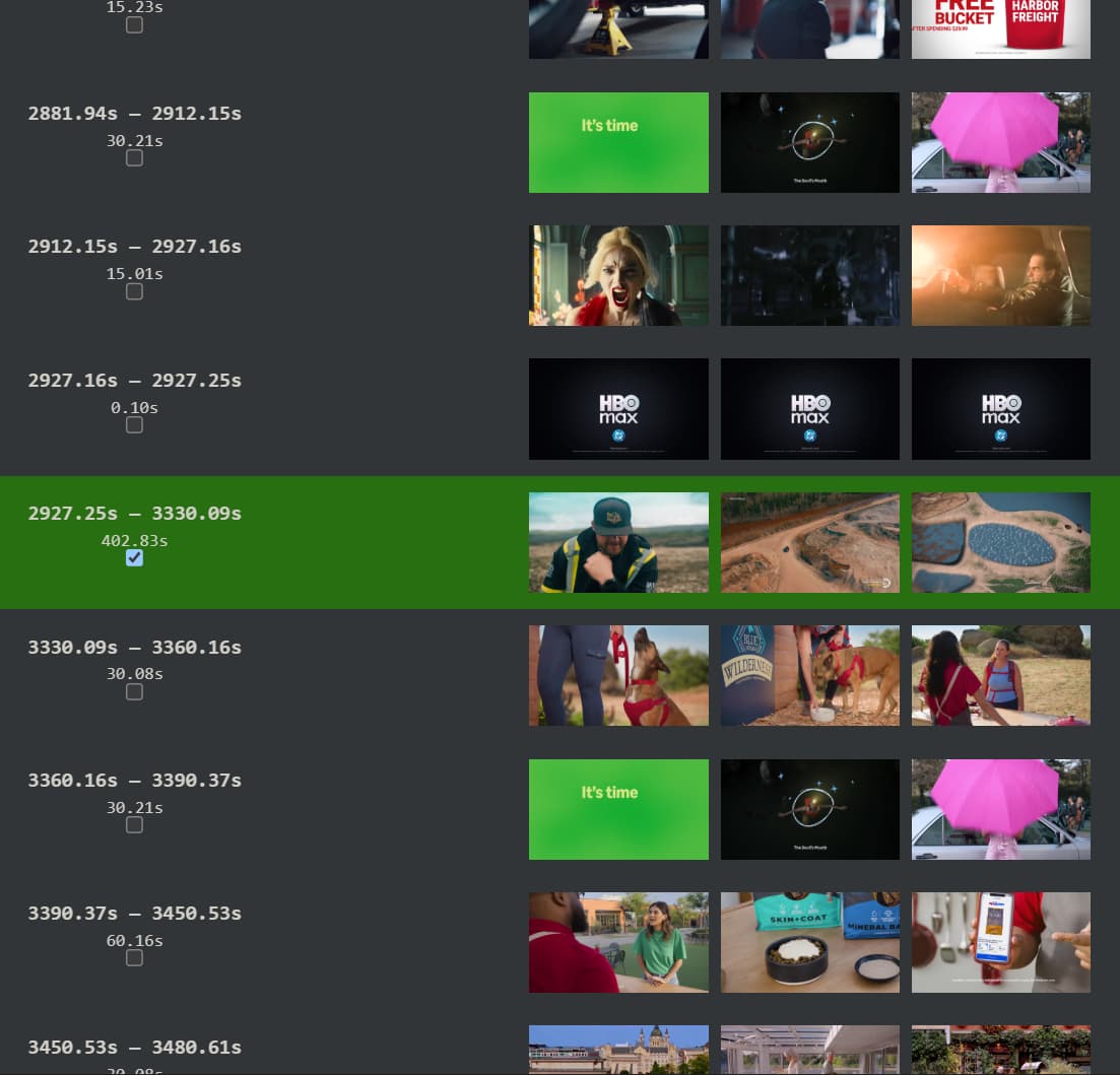
v2 only shows 3 lines so it makes it easy to loose track of where you are in your scroll and miss segments.
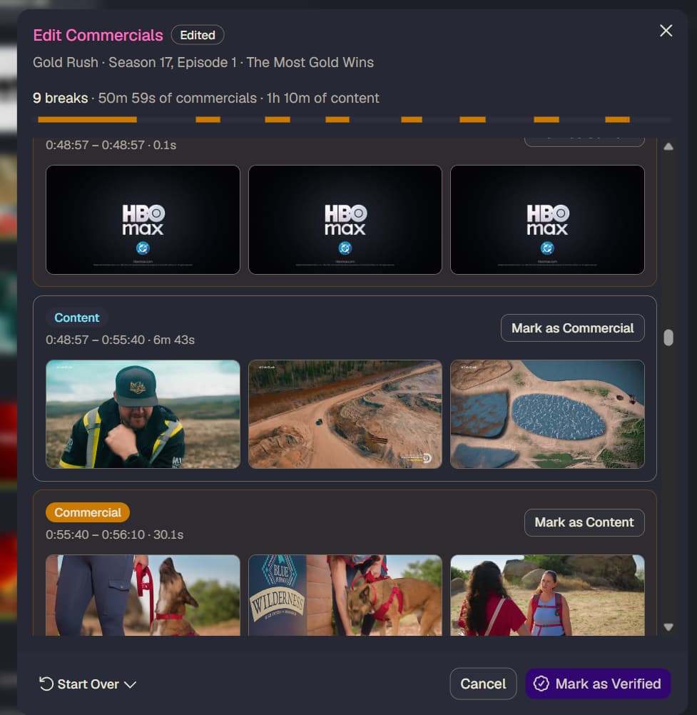
would smaller thumbnails with click to zoom be an option?
also I'm sure we don't need all these details, but the padding info was useful while editing.
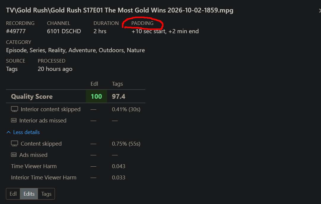
the old interface let us toggle between Edl, Edit, Tags, ect. to compare without completely starting over.
2 Likes
Is the sidebar not sticky to be minimized?
I minimize it, but then refresh the page, or re-open bookmark, and its expanded again.
I personally hate sidebar style for main navigations, prefer top bar as it takes up less space overall on screen, though minimize a sidebar is acceptable.
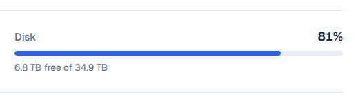
I liked being able to see the % used to the first decimal place, rather than rounded to a whole number.
However, I do like that the total storage space is identified.
OLD:
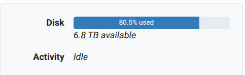
V2:
1 Like
For the web player, can we get skip forward 30 secs and skip back 10 secs buttons like in the v1 player.
Using left/right arrow keys only moves 5 secs in Firefox.
Using shift+left/right arrow keys only moves 10 secs in Firefox.
Home Page options on settings is missing "Status" page as an option
2 Likes
In the guide, when you click on a channel tile it goes to a page with upcoming programs for the channel. When you go back, it doesn't maintain the position in the guide, it returns to the top.
Also, it would be nice if the upcoming programs page included the channel name and/or description.
1 Like
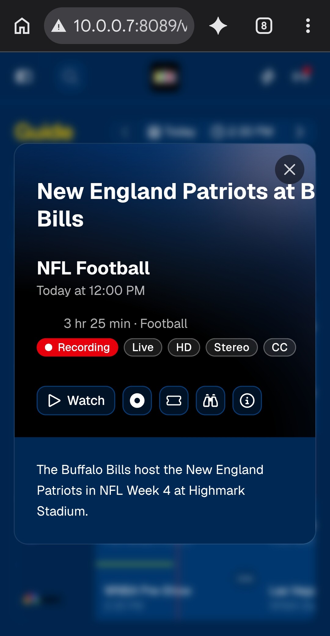
The live player is missing the options to start recording, new season pass, and the More airings.
At least the player works now in Chrome based browsers...
The first title card pages, u have those options...i assume that is by design now?
Meaning u have to back out of live playback to get to those options.
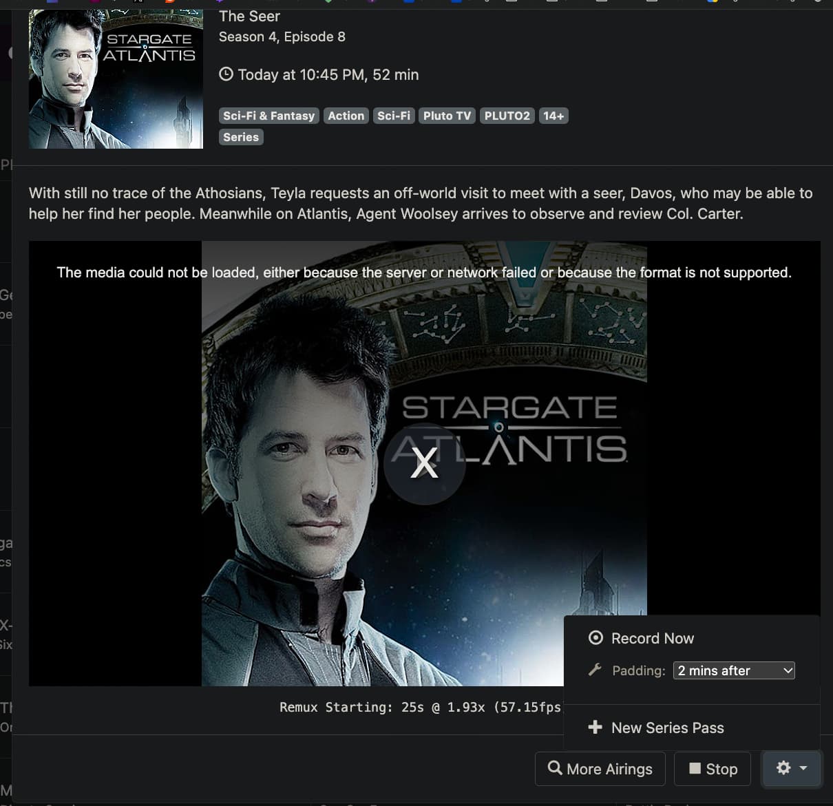
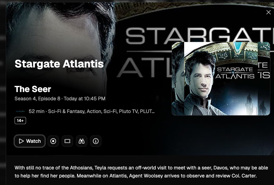
There’s no plans to have that in the actual video player anymore.
Technically, those weren’t in the video player previously, but in the modal frame the video player was embedded in.
So yes, your interpretation is right.
Hopefully this new guide design will also be used in the appletv/iOS versions of channels. The purple and such has kind of runs its course IMO.
1 Like
I don't know if anybody cares about the mobile version  but I found a functional bug: when you open the
 Settings page in portrait mode, the top buttons/icons don't do anything, you can tap on them all you want but nothing happens.
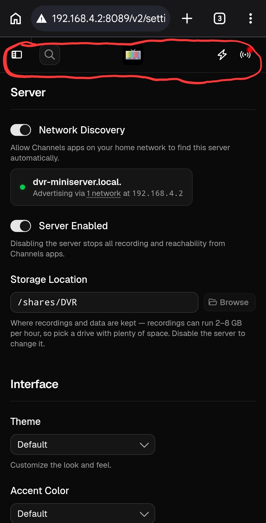
There are two ways I found to get unstuck:
-
Tap the phone's back button to return to the previous page
-
Rotate your phone to put it in landscape mode and then right away rotate it back to portrait. When you do that, the top buttons become active. When you're in landscape mode, the menu in the left pane also shows up and it works.
1 Like
Having used the new commercial editor once now, I'm going to double-down on my dislike for it. The extra vertical space between the rows of thumbnails makes it more difficult to notice changes from one row to the next. I also find my attention being drawn to the decorations at the top of each block, rather than focusing on the thumbnails.
I'd suggest you keep the current thumbnail size but widen the pane and move the decorations to one side or the other. Also, increase the background contrast between the content blocks and the commercial blocks. (I like white as the background of content blocks.)
Sorry if my suggestions offend those who use this on a phone.
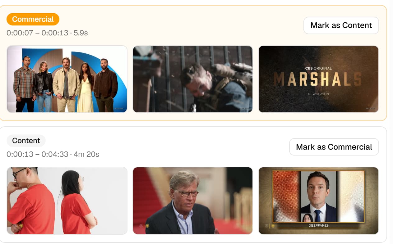
ETA: I also kind of miss the fun-facts that were present at the top and bottom of the old commercial editor.
2 Likes
That's a good idea, I like it. 
It seems that I spend more time with the commercial editor on my phone than on a computer, mostly for convenience and quick access, I guess. So, for me, I like the bigger pictures, but I'm not offended. 
Great feedback on the editor, thanks.
1 Like
Another difference between the Legacy Manage/Recording view that I'm seeing with the v2 Library view is that it no longer shows what channel the recording comes from. I see that I can click through to the details but I'm hoping the channel info badge can return.
4 Likes
This is awesome, thanks!
I ran into one defugalty: when I tried to connect PlayOn Cloud, it kept failing to authenticate, it would just repaint the dialog. I tried it in a new browser window and it worked fine, and shows up as connected in the management UI now.
FWIW, I'd love to see a "History" or "Activity" entry in the DVR section to get to the DVR recording history unambiguously. I know that it's redundant with the library view, but I didn't know what I was looking at until I read the comments about what happened to the "Manage" DVR item.

Agree, give us the channel number and channel name it was recorded from.
I will say the channel name is more important to me than the number, but would like both.
1 Like
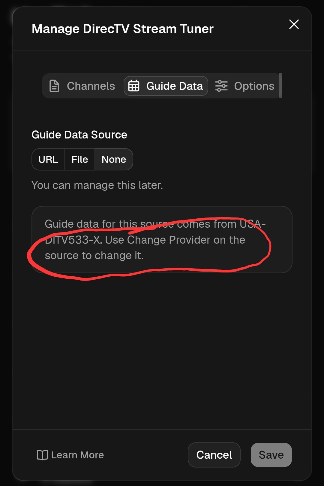
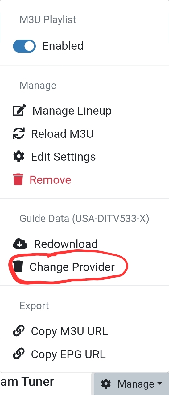
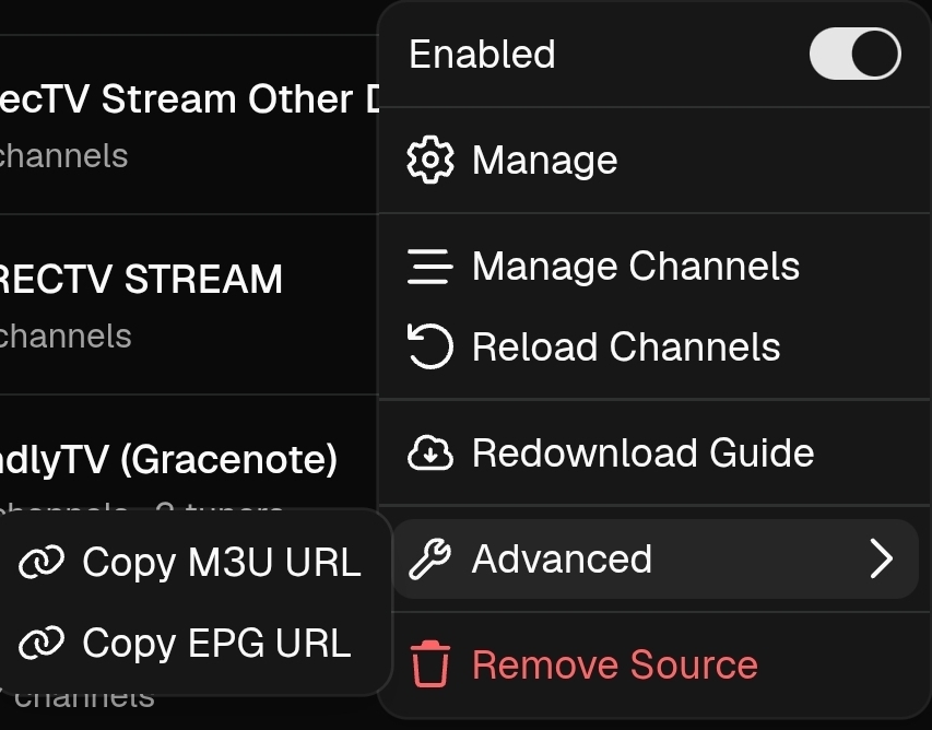
Where is Change Provider on the source?
I don't know if there is something wrong with me but I can't find it.
Legacy version:
V2:
so you got me to play around on my phone, no algo needed.. lol the pictures should probably not be any smaller on the mobile especially for those of us who like/want small screens..
also now that we have icon's in the activity window, could those be clickable to take us to what i call the watch card? (episode card?  )
)
ps. I decided on video store for phone, but like nosferatu on my laptop