Hide Guide Categories - HD, SD, Favorites

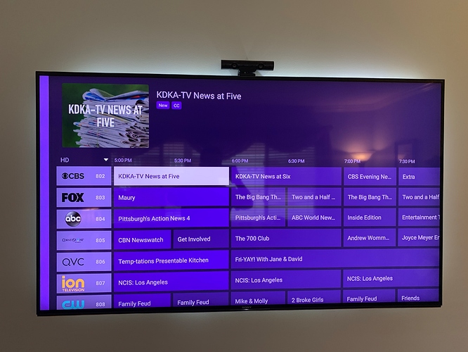
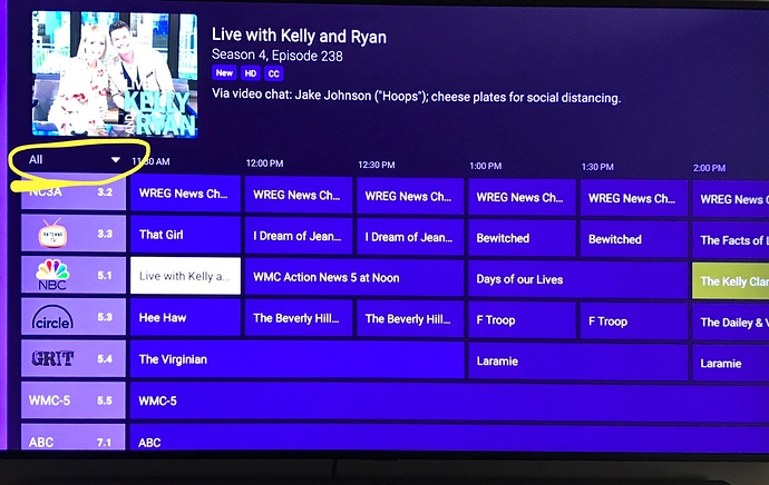
I would love to see an option to hide the different categories on the guide. I’m not sure about everyone else, but I never change my guide selection from HD Channels. The option to hide this would allow for more room to view the guide and see further ahead - up to 3 hours of the guide. To me, it feels a bit cramped on the screen.

For those who don’t know what I’m talking about, it’s the different categories that you can select from on the left portion of the guide.

  • All Channels
  • HD Channels
  • SD Channels
  • Favorites
  • Movies
  • Sports
  • Drama
  • News
  • Kids

What are everyone’s thoughts?

I like this idea. There are too many ways to accidentally - thanks to the hyper-sensitive Apple remote - end up somewhere you didn’t intend to be.

4 Likes

This isn't exactly what you were thinking, but maybe achieves something similar. Is there a way to change the grid? Can the user set it to have 10 rows instead of just 7? And/Or maybe show 4 hours of programming instead of just 2.3?

Large TV's often times allow us to see more on one screen.

Increased lines in the guide would be a nice optional feature. For the size TV I have, I’m content with the current amount of lines displayed. I would just love to hide some of the options I never use. I’m a big fan of a very clean simple layout. Like the other post mentioned, that Apple Remote is sensitive, and the less I have to mistakenly click/change the better.

1 Like

I think hiding the side bar options would be great, nice clean and simple.

5 Likes

I'm a new (and very happy) subscriber, exploring all of the options in Channels and really enjoying the experience so far. This is the very first thing I thought to ask about, and I'm sharing the same suggestion.

At the very least, there should be a feature or option to hide both the SD and HD categories if there are no SD channels at all! I only have HD channels, so the "All Channels" and "HD Channels" are identical, and the "SD Channels" category is empty, which is a waste of space and confusing.

I'd prefer for it to just show "All Channels" and "Favorites," along with the other categories: Movies, Sports, Drama, News and Kids.

3 Likes

I seem to remember asking about this previously and was told something was in the works for it.

It takes up too much of the screen, and as others have said, if you are not precise when navigating with the remote, you end up in a different category.

1 Like

I agree besides the remote itself this is the biggest drawback to using the atv4k with channels.

Call me an outlier...I use the various filters from time to time.

I dont think anyone would like to see this ability removed. Just the choice to hide it to make it more wife and kid friendly.

Kind of like the On Now tab. The menu above is hidden until you hit menu...I think

If you’ve ever used the Android TV Channels app, it’s perfect. It still has the guide categories but they are tucked away in a small menu above the first channel. It gives you a wider guide to view and makes it much harder to accidentally change categories.

2 Likes

I agree the android version is the better way to do it. But I bet there is a good reason they didn't do it this way in the atv4k or I think they would have.

This is the way it is handled in the FireTV version. I cannot stand this in the TVOS version and it’s one of the reasons I will not use it.

2 Likes

I would love to see this change. Some unnamed user in my house accidentally changes the category and then can't find the channel they want.

2 Likes

I have to agree. Aside from the occasional "crash" (where the app just closes), the UI in Channels is the main reason it's NOT my go to app for viewing. I mainly use it for watching / recording TVE channels, but for live OTA I use Plex and for playback of pretty much ALL recorded content I use Infuse.

2 Likes

Is this on the roadmap to be implemented?

A little UI refresh would be great! Not sure if it’s on the radar or not, but there are numerous requests for it and a different color scheme. Hopefully there are some options being worked on.

3 Likes

I would also like to see this. After adding a large number of additional channels via the M3U playlist functionality, it's now more disruptive than ever to accidentally change the category and end up back at the top of the list.

3 Likes

I got the latest Apple TV 4K 64GB for Christmas. First thing I did was load Channels DVR and I like it a lot more than Channels on Android so far. First thing I saw was this guide categories column to the left of the guide and didn't like how it takes away from the guide screen real estate. However, I no longer scroll right and left on the grid guide, because on Apple TV I can just click the channel logo number in the guide and get the Upcoming shows, movies, specials page. The Upcoming functionality of the guide is a game changer and makes it a lot easier to see what's on later in a quick manner. Also, allows for quick checking when a movie is on again later.

3 Likes