New Recordings View Feedback (on testflight beta only)

Hey everyone, the latest beta on Testflight of the Apple TV app has one of the bigger new features on it. We want you guys to put it through it's paces before it ships out.

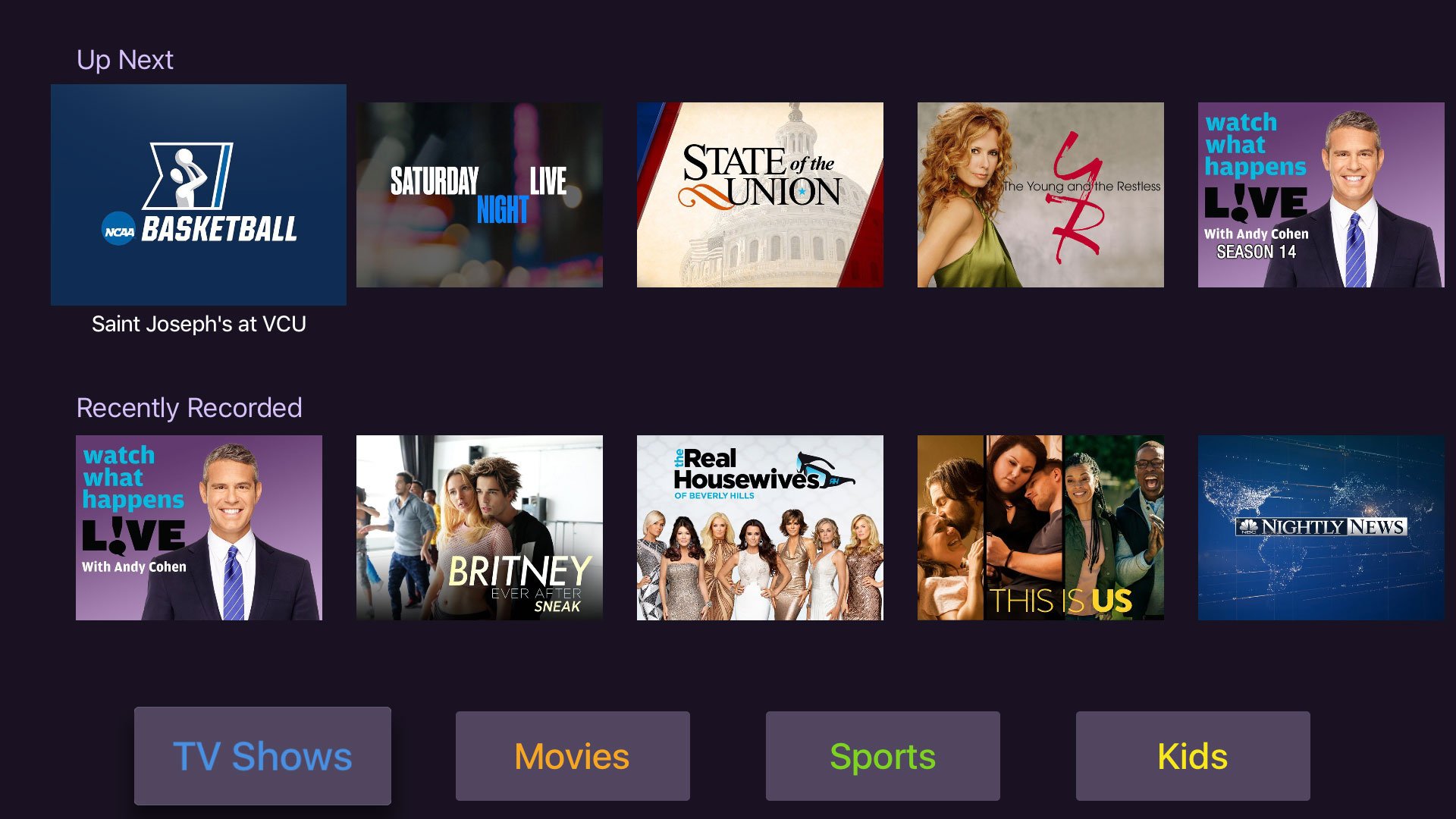
The new Recordings is organized to surface your recordings in different ways you will probably consume them so. This should allow you to get to them faster and easier. We really think it's going to do well at suiting different people's workflows.

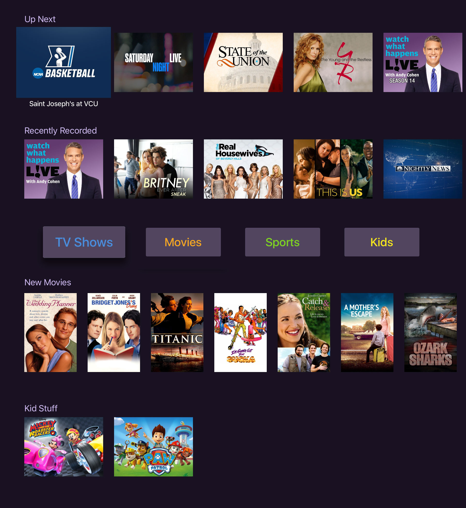
It has 6 possible sections:

  • Up Next - Suggested episodes you should watch next based on your watch history.
  • Recently Recorded - Shows in order of last recorded.
  • Library Buttons - buttons to browse your recordings directly. View ALL your shows, or ALL your movies, or ALL your sports recordings.
  • New Movies - Recorded movies in order of last recorded.
  • Kids - Kids shows in order of last recorded.

These sections will toggle their visibility based on whether or not you have any content for them. The same goes for the buttons. The view is even smarter in that if you only have a few items recorded, it collapses into a single grid for your recordings. Once your content grows, it will expose this new expanded view. So, if you don't see this new view, its probably because you don't have that many recordings.

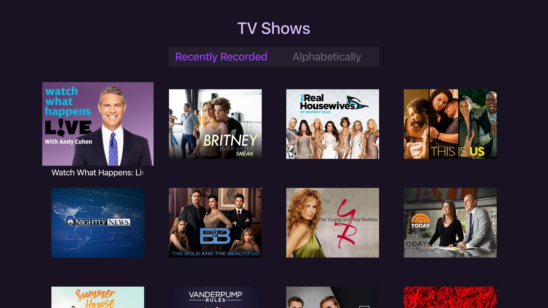
Picking the buttons will take you to the new listing view for your content. What's nice about this change since this is its own view separate from the root Recordings view, it can have it's own segment bar that allows you to sort your content by either recording date, or alphabetically. With the old Recordings view being all one view for all your content, there was no great way to sort things yourself since the segment bar was already in use to filter content based on context. We think this is going to be really helpful. It's been a big request.

So please put it through its paces and report any bugs or feedback in this thread. Thanks!

Here's a full shot of what the view looks like filled out:

6 Likes

Looks really nice!

2 Likes

I need to tell my supervisor im getting the flu and need to go home early.

2 Likes

Is it still possible to get in the testflight group?

How do we get in on the Test Flight version?

Thanks!

Thanks. I must be on the waitlist then as I already did that. Thanks!

2 posts were split to a new topic: Sorting feedback

I don’t like going sideways to see everything on Up Next, so I’m not a big fan of having Up Next and Recently Recorded on the main screen. I’d rather just keep the way it was with Up Next, and then add a tab at the top for Recently Recorded. I also don’t like how TV Shows and Kids moved to the bottom. Everything else has the menus at the top, and this just seems backwards.

I like being able to click on TV Shows and sort by recently recorded or alphabetically, but it’d be nice to have an ‘unwatched’ indicator here so show which show has something you haven’t seen yet.

So all that to say… I prefer the old way because it’s less manuevering to get to a show that’s up next, but I like the new sorting for the TV Shows/Kids sections. For example, Supergirl is 9th on the list… I want to watch that and on the old way I go down three and over one (it started me in the middle) so that’s 4 moves to get to it. The new way I go over 6 and click, so +2 moves. But that number will get higher the farther in the list I have to go to find the show that I want to watch in Up Next.

Initial thought on the new recordings view is that the differences between it and the rest of the Channels tvOS application are disorienting. This view has horizontal scrolling and bottom of screen options that don’t appear anywhere else in the application.

I recognize that it is a challenge to work within the confines of options presented by the tvOS, but I prefer consistency across features with less functionality then having options work differently.

That is my first impression. I’ll see if it grows on me over the next couple of days.

A couple thoughts… one is the latest TestFlight beta messed up my top shelf so it doesn’t work. Also, I’m confused why this is a TestFlight beta discussion but it’s not in the beta section of the forums. I guess calling the DVR a beta throws off everyone haha.

The other thought that has been bugging me is that there isn’t the list of shows at the bottom of the view when you press on an “up next” episode. It throws me off. Sometimes I use other means of watching a show and I just want to press on the “Up next” episode and be able to see where I’m at in the series with what’s unwatched so I can choose a different episode. Basically every other view shows the bottom row of episodes except “Up next” so please just put it in there for “Up next” too!

And I honestly just don’t trust the “Up next” suggestions. I wonder if they really do pick the most recent one or not so it throws me off. Which is related to the above problem of not knowing what episode I’m on visually in the series when I click on a show. I think the documentation will help me figure out where the “Up next” logic is but until then I’m a little weary of the whole feature.

And I don’t have any sports, kids or news on my recordings so it’s hard to judge for me whether the new view helps or not. But since I only record a handful of ota shows a week the new look is fine with me. I could imagine someone with a lot of recordings might find it a bit harder to find stuff though.

Because what you’re selecting is a recording. So it takes you to the recording view. Up Next is a list of next to watch recordings. From that list you can just click play and it will immediately play.

This is totally fair. What is in there right now is a first pass algorithm and it doesn’t take into account everything we want to do to calculate them. Heck, they don’t even live update yet :frowning: There is a plan to do another pass and get it like we want, it’s just on the back burner right now. Trust is the #1 priority for Up Next, I hear ya. Without it, the feature is useless. So our goal is to get it right.

1 Like

I guess what I’m getting at with the Up next view is something like infuse uses. You click on the show and it brings you to the episode to watch next that is recommended… but it still has the row of episodes below in the same view. So what I’m pitching is to have the full episode list included below the episode description on the recording view. Hope that makes sense.

It’s actually more useful when you have a variety of these, since they’re surfaced better and it’s easier (and clearer) to navigate to them, vs the old segmented bar that was annoying to get to and was very limiting in being able to sort.

I totally get your case though, having ONLY TV Shows. The new view isn’t as helpful when you only have TV Shows. As described in the original post, the view has the ability to collapse into a single list of shows if you don’t have a lot of content. We can expand that to the scenario in which you ONLY have TV Shows (no sports, kids shows, or movies). This means a big old grid of shows sorted by when they were last recorded.

Would this be more helpful? It means you’d never get the new style’d view unless you have the other type of content and you get a very simplified view of nothing but your TV Shows. It also means no Up Next. Which is enough to kill the idea for me, because Up Next (when working well :tongue:) is very useful. Browsing sucks. Channels should be telling you want to watch next.

Here is the other thought I forgot to add while we are on the subject haha… when I’m in a “Up next” in the recording view and I wonder where I’m at in the season I can’t quickly find that out by glancing below. Ok I’m done. Those are all my thoughts on the subject. Just had it brewing for the past month as the one thing that has been bugging me from the atv set up.

I’m in the same boat. My family only seems to record TV Shows (253 recordings thus far) so the new layout is kind of awkward. I get the idea of what Up Next should be, but I know I’ll never use it (even if it does improve). Perhaps out of habit, I know I’m likely to only look at the recent recording list and work off of that. I’d vote for your suggestion to see the big old grid of shows for the scenario when you only have recordings within a single category.