UI redesign for personal media?

Just wondering if there are any long-term plans to redesign the Library view of Personal Media (i.e. Movies and TV Shows)?

I know the Channels team has indicated they want Channels to become a single source of all content, but it has a long way to go on the user friendliness of the metadata that is presented when looking at stuff imported from personal libraries. The UI sort of needs a complete refresh - it just looks pretty antiquated compared to the competition.

Thanks!

We’re always improving things, bouncing between priorities. Long time fans can tell you that things are always moving around here.

Lately it’s been about customizations like Personal Sections, allowing you to completely curate how things are presented and to create full browsing trees to make the app work how you want it to, based on your content.

Do you have any feedback other than “it’s antiquated”?

Feel free to detail what you feel is missing or is bad, just mentioning that it’s not good doesn’t help.

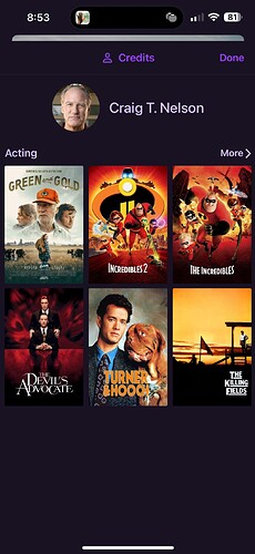
  1. Photos of cast, along with the ability to see other movies/shows in your library that the cast is in.
  2. Automatic collections creation (based on data from external sources) - for example, put all my James Bond movies together for me.
  3. Some sort of alphabet/letter selection listing to indicate where you're at in a large library (so I can scroll to the letter "S" for example).
  4. I think if you tighten up the poster view, you could easily fit columns across instead of the 5 currently (on tvOS).
  5. Ability to display fan art when viewing the details of a movie (currently it just shows a larger version of the poster).

I wish I had the time to help you guys (although not even sure you allow that lol) - I'm beginning to really like Channels and would love to help out with stuff like this. Although my dev skills are pretty rusty!

Thanks, a lot of that is already on our long list, but most of it requires some of the work we've been working towards in terms of our metadata indexing. It's complicated building UI when content is indexed from 2 different metadata sources as the only features/UI you can build are based on data both sources can provide, leaving you in a lowest common denominator problem.

Work has been made for the last year in creating universal metadata across recordings and personal media this year for movies. We just need to do it next for TV shows.

Once both recordings and imported content have normalized metadata, we can build richer things since the data will be there.

We've mostly prioritized other things in Channels though. Could the movie view be more rich and look fancier? Sure, but at the end of the day, you see it for 1 second before watching the movie. So our priorities have been in stability and reliability in video playback, which I think Channels does better than most other video players, and personalization in how the app works and how you want to watch and browse things, which I know Channels is better at than most.

So the short answer is, yeah, we want all that too.